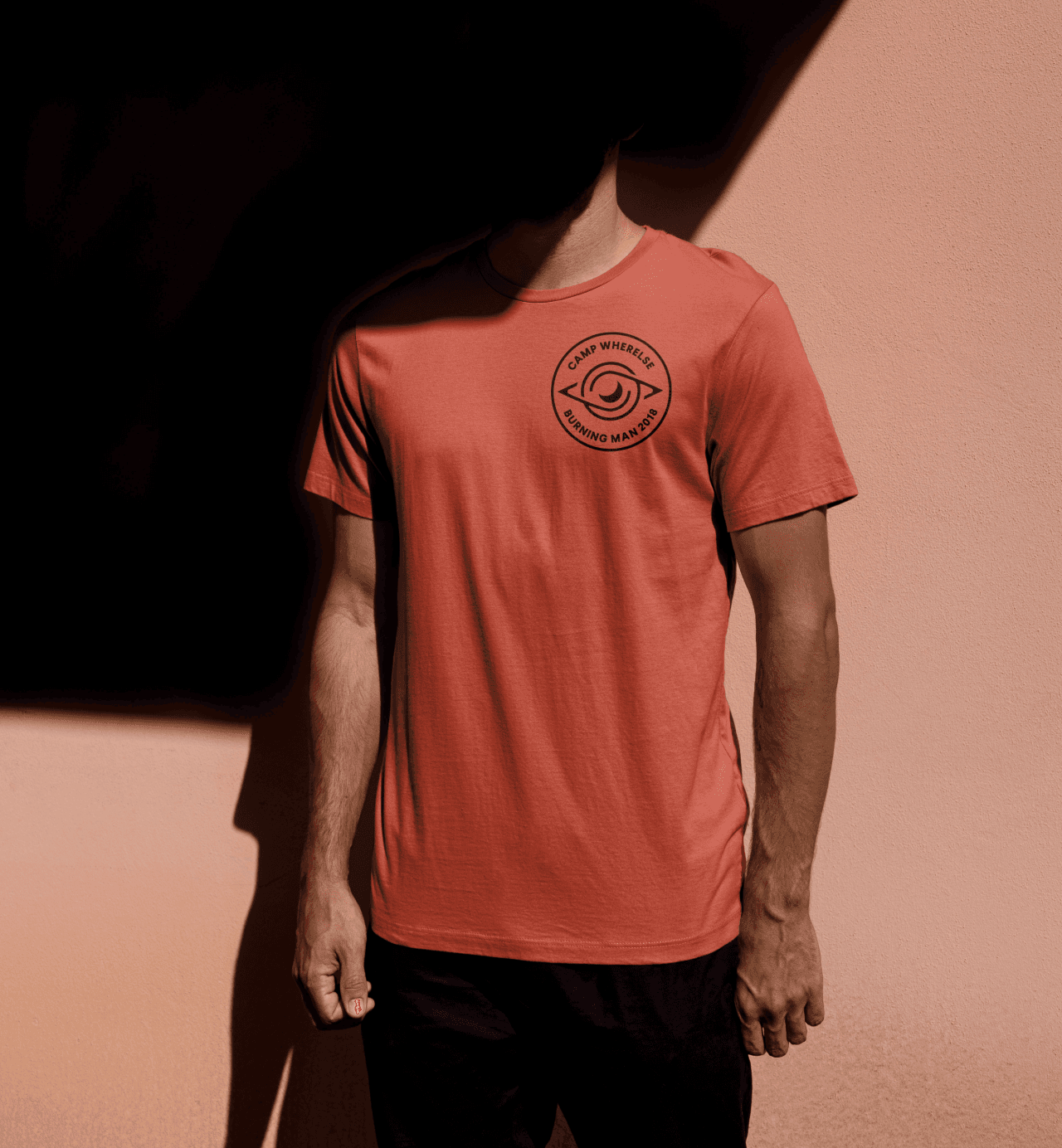
Camp Wherelse Branding
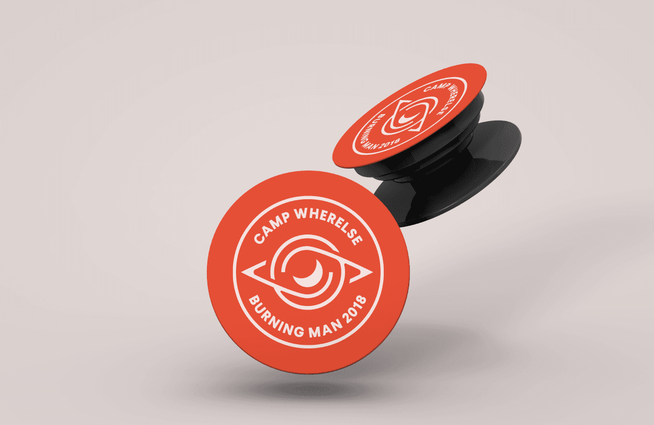
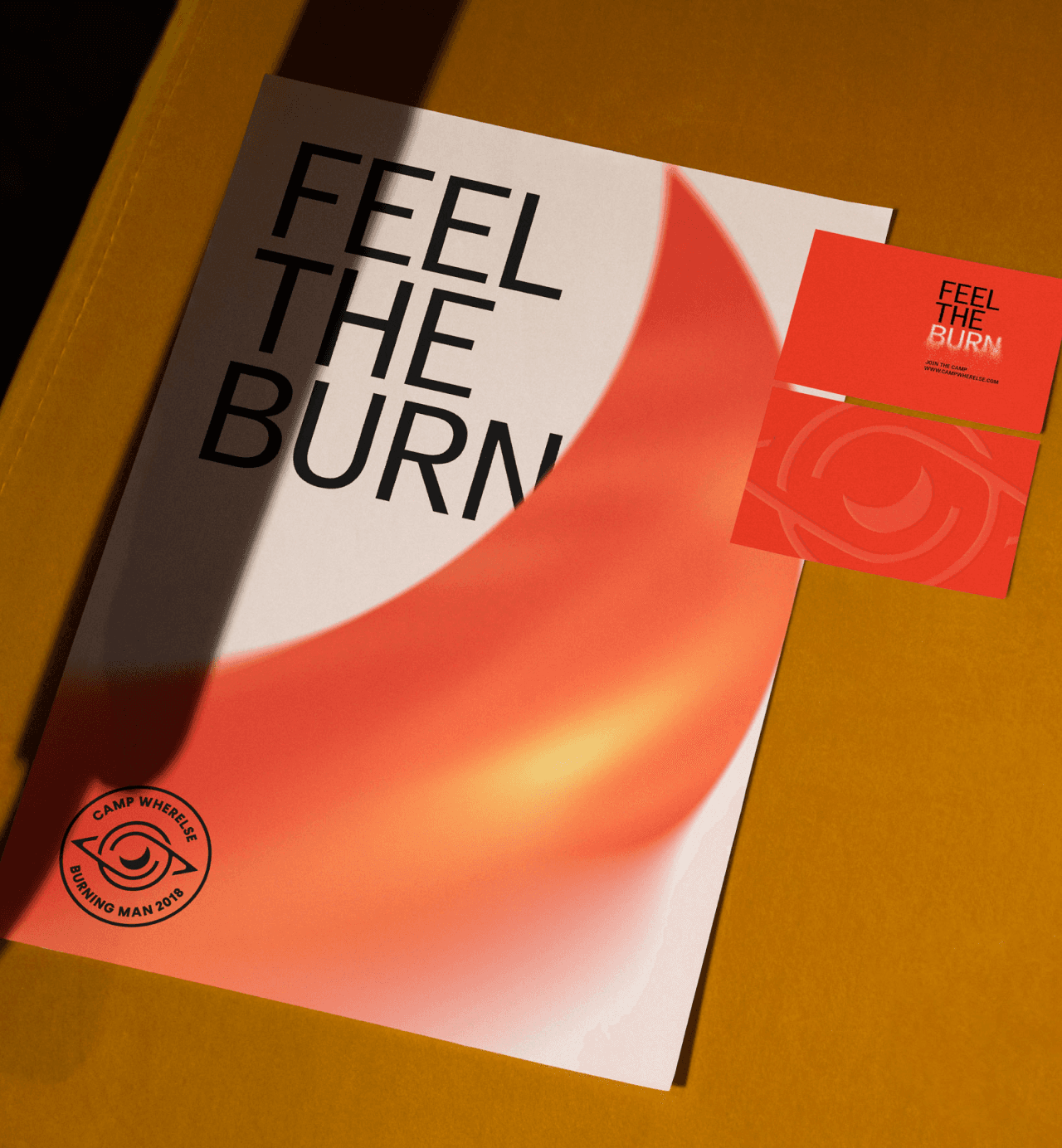
Camp Wherelse is a art camp at Burning Man. Their leaders approached my about doing some basic brand work for them. This culminated in a flexible logo system that tied various spiritual narratives together and wearables that the camp could use to incentivize participation.
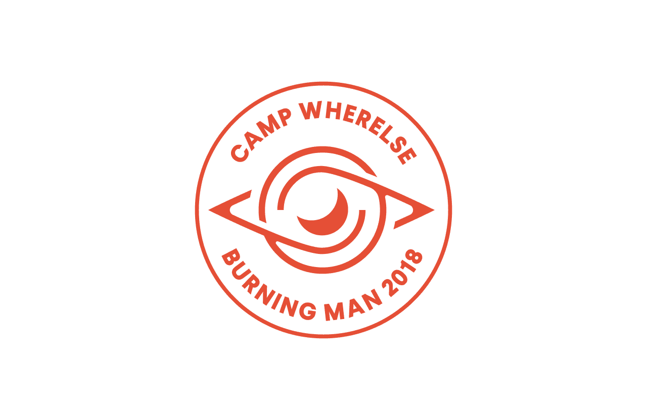
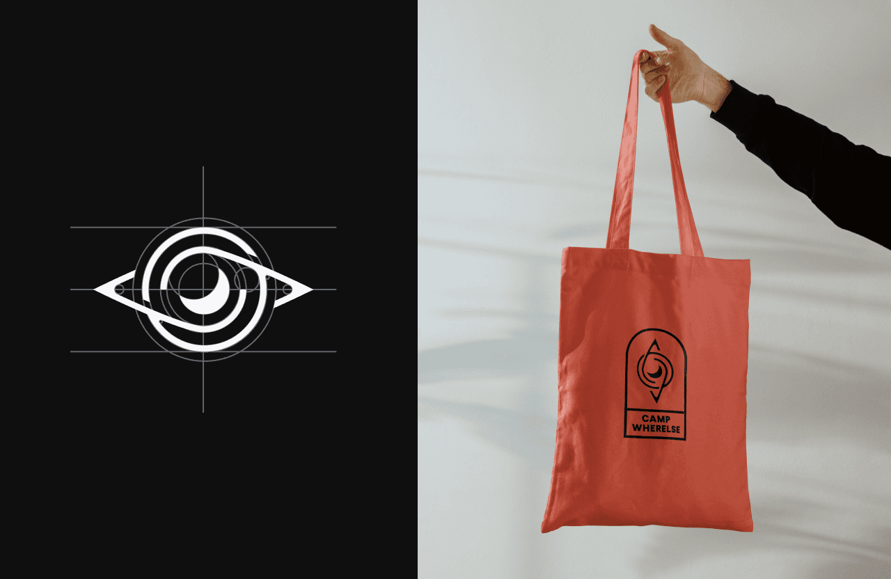
The logo mark is a marriage of a couple different concepts; the entirety of the mark resembles a compass to pay homage to the souls way-finding that takes place at burning man. The eye, which resembles the third eye chakra is built in the shape of Saturn - the astrological ruler of Karma. Finally, the pupil takes on the shape of a crescent moon, the ruler of emotions and the inner self in astrology.
Client:
Camp Wherelse/Burning Man
Category:
Branding
Print
Period:
May 2019
Sample Project
Camp Wherelse Branding
JOSHY COLEMAN
•
Brand & Web Designer
•
Let's work
together
