joshy coleman

SENIOR BRAND & WEB DESIGNER

[MENU]

joshy coleman

[MENU]

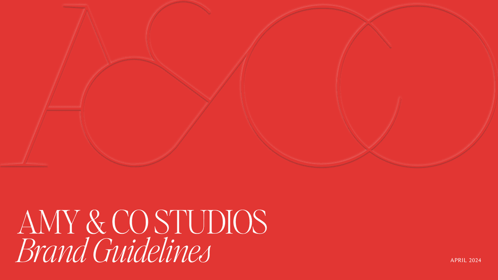
Amy & Co Studios

Amy & Co Studios

Amy & Co Studios

Brand Identity and Website

Brand Identity
and Website

Brand Identity
and Website

2024
2024
2024
BRAND DESIGN
ART DIRECTION
ILLUSTRATION
WEB DESIGN
BRAND DESIGN
ART DIRECTION
ILLUSTRATION
WEB DESIGN
BRAND DESIGN
ART DIRECTION
ILLUSTRATION
WEB DESIGN
ROLE
ROLE
ROLE
BRAND DESIGNER
BRAND DESIGNER
BRAND DESIGNER

/Over-

View

/Over-

View

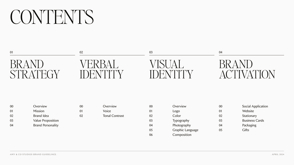
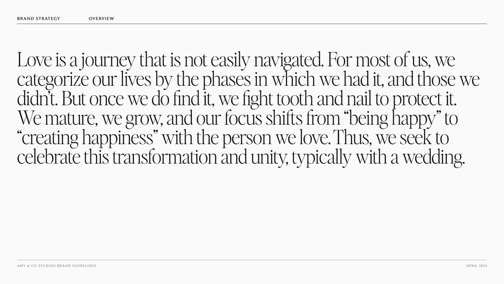
In 2023 Amy Reeves decided to split from her business partner and lean fully into her own ardent event planning studio. Having done the branding for her previous company, she reached out to me to help her build a new identity focused around her unique and unconventional approach to wedding/event planning.


This project was super unique in that Amy had already been through my branding process previously. Thus warranting a new and innovative approach.

/Solu-

tion

/Solu-

tion

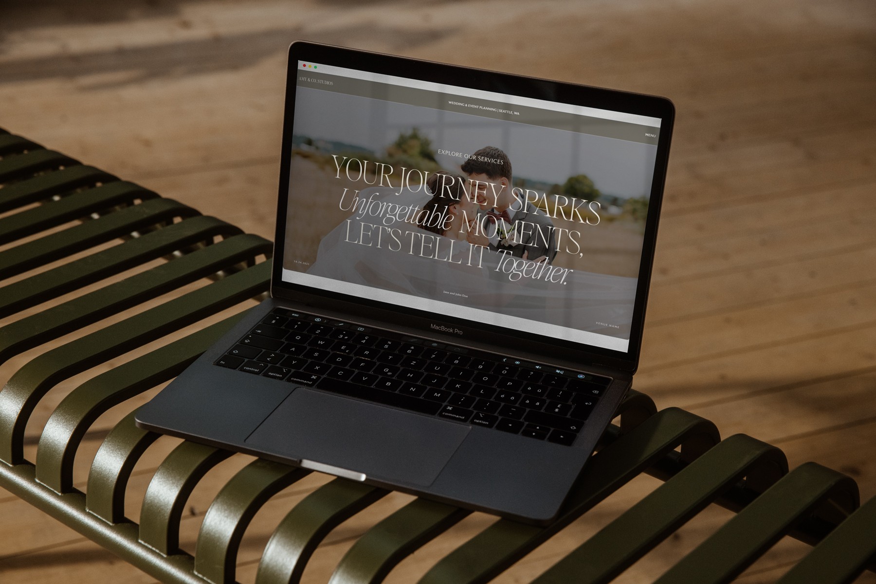
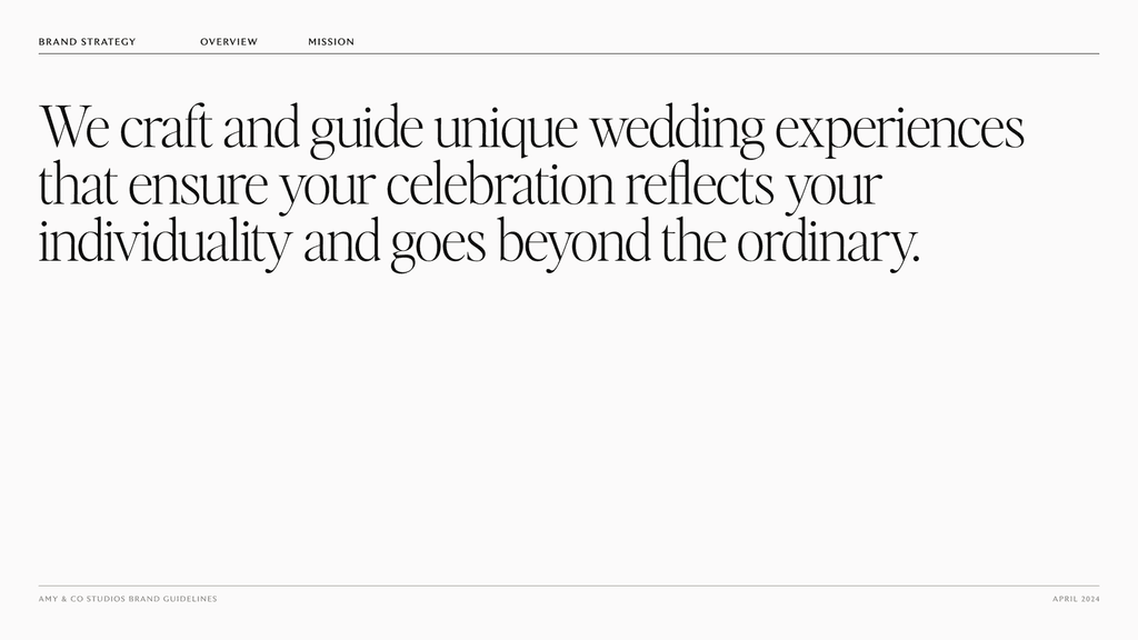
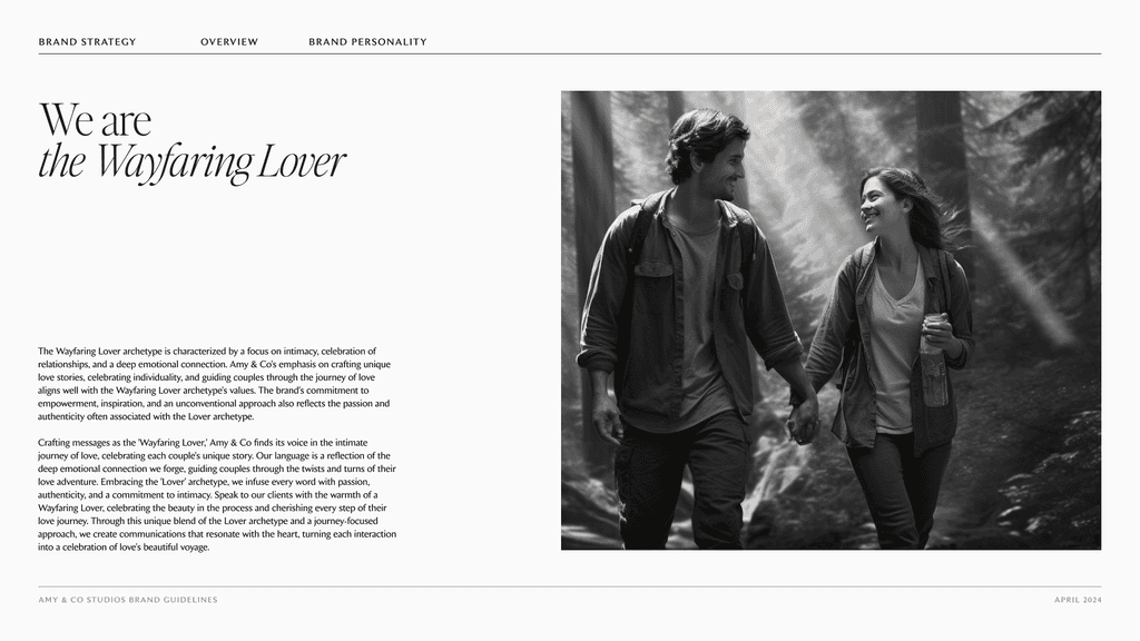
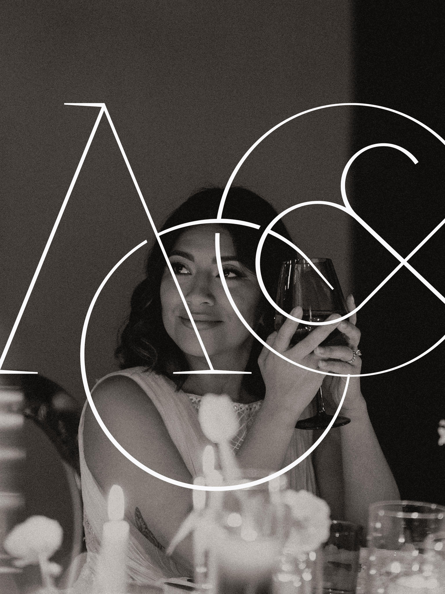
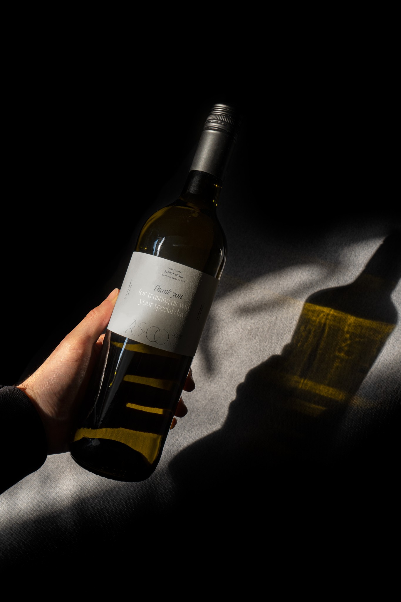
The resulting identity captures the luxury that is ever present in the event planning space while infusing special moments of Amy and her team throughout it's visual language. Most importantly love is rippled throughout the entire identity and web experience, centering around the journey a couple one embarks in marriage and in love.

/Inspiration

When ideating for Amy & Co Studios I was drawn to organics and neutrals. Amy focused in heavily into greys, slates, and even greens, but also loved the classic design styles we see in editorial design. These two themes created space for infusing human touches and creating a more organic approach to what luxury looks and feels like when imagined with a non-traditional lens.

/Typography

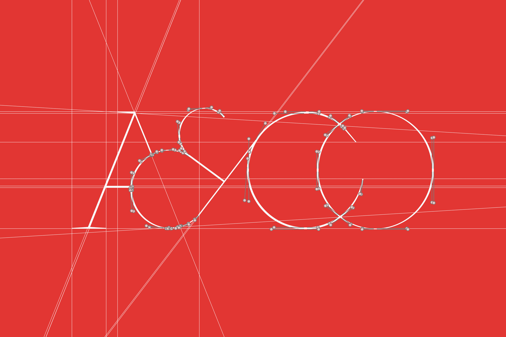
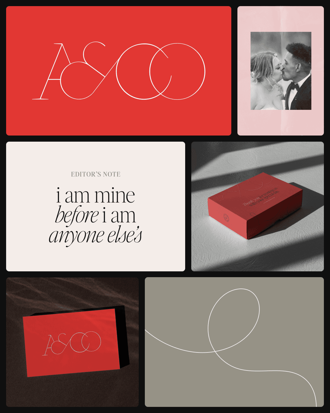
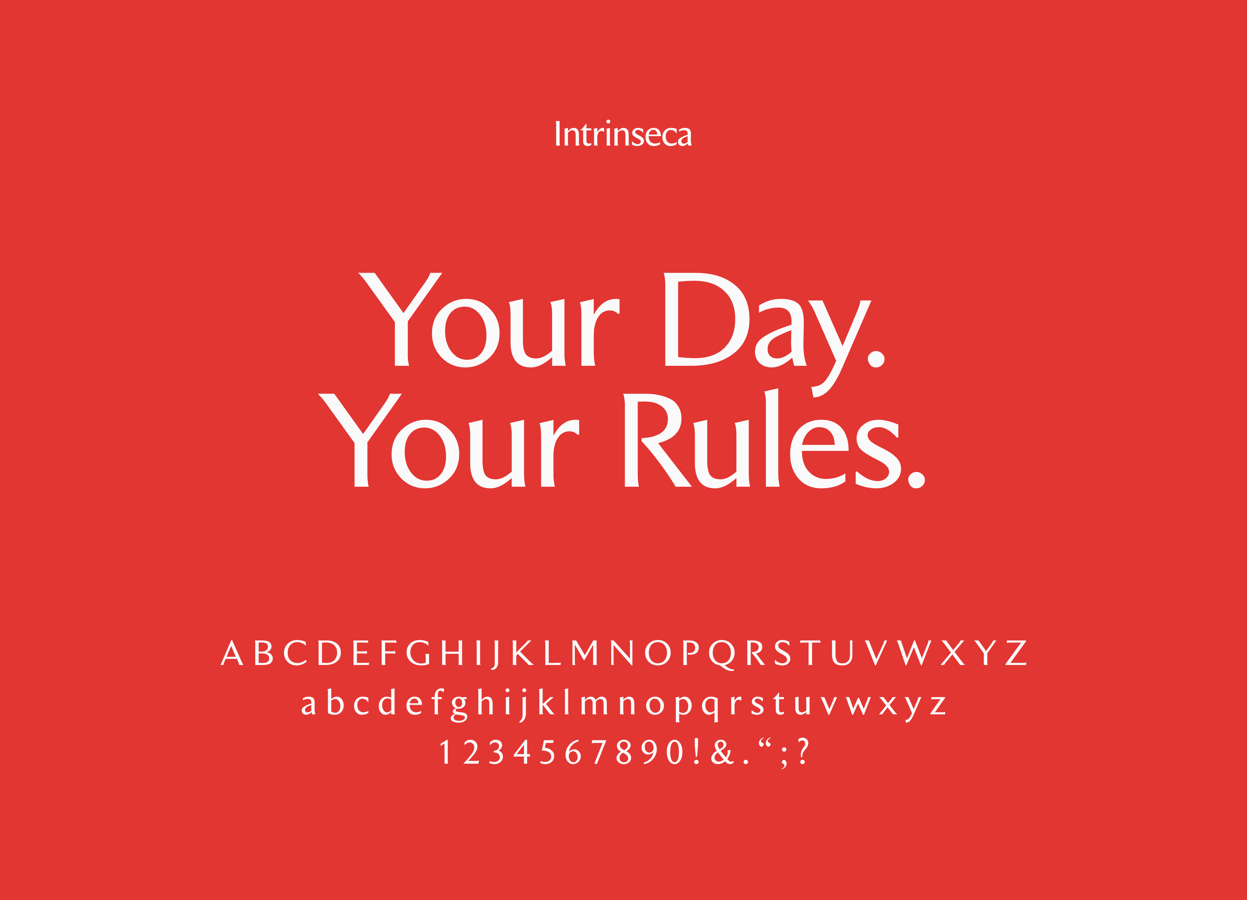
I knew that because Amy & Co were so into minimalism and the sophisticated tones it often boats that arming her team with a power yet human serif would be the cornerstone of a sustainable type system. I opted for Jen Wagner's "Editor's Note" leaning heavily into the italic weights to create visual contrast for headlines, and testimonials. Intrinseca was used as the secondary typeface because of it's earthy and luxurious stem widths and embellishment.

I knew that because Amy & Co were so into minimalism and the sophisticated tones it often boats that arming her team with a power yet human serif would be the cornerstone of a sustainable type system. I opted for Jen Wagner's "Editor's Note" leaning heavily into the italic weights to create visual contrast for headlines, and testimonials. Intrinseca was used as the secondary typeface because of it's earthy and luxurious stem widths and embellishment.

/Color Palette

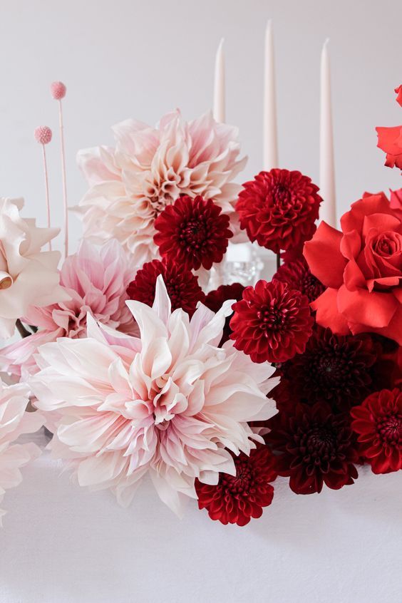
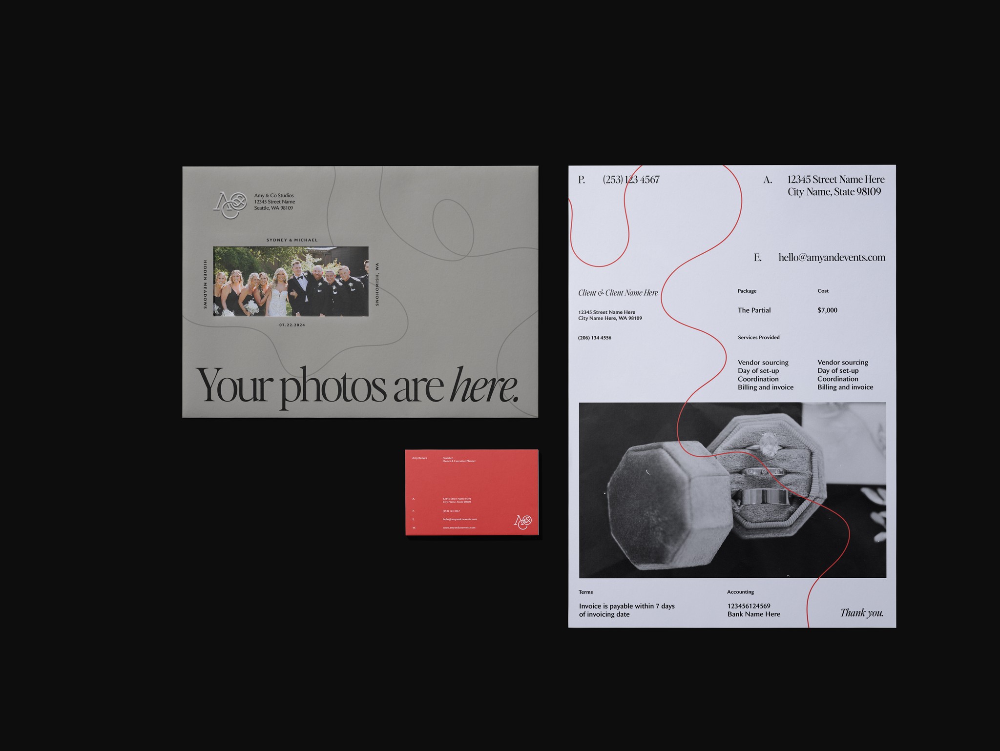
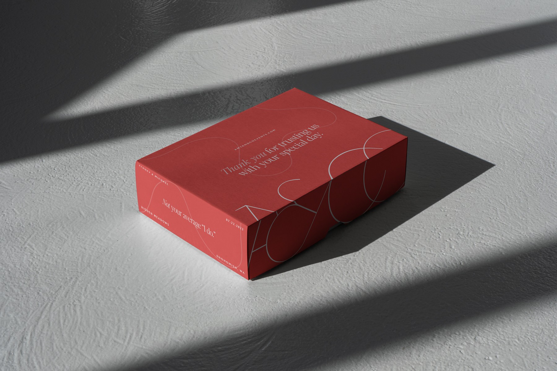
The event planning industry at large LOVES their neutral palettes. When kicking off the color conversation with Amy & Co, I recommended that the brand lean into a stronger accent color to really help break up the otherwise neutral palette that we see commonly across the industry. This palette took many iterations at one point boasting a more neutral red wine color. Finally, Amy found a red that she fell in love with, and thus I worked to incorporate it as the brand's power color.

/Journey Lines

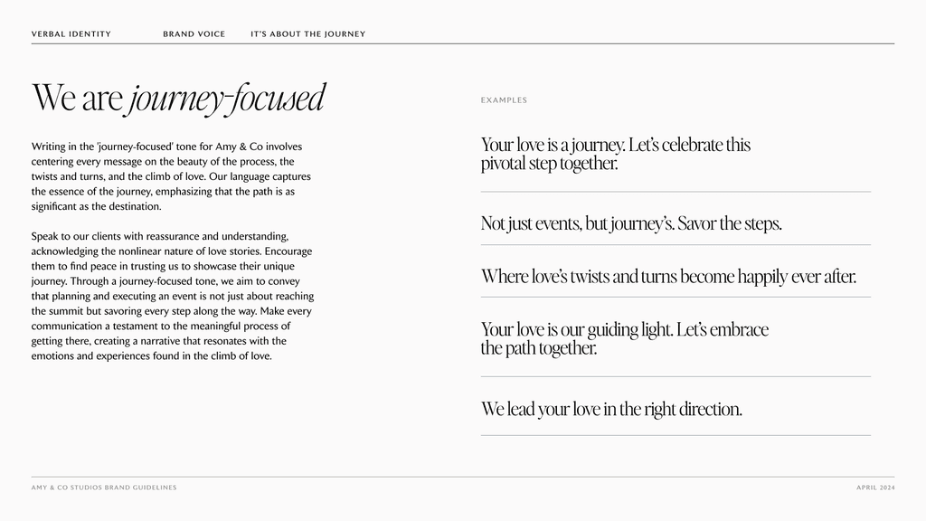
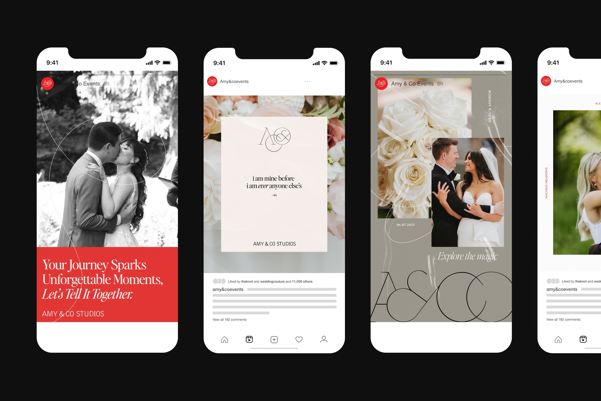
When going through the foundational phases of branding exploration for Amy & Co, I really indexed on the idea of love being a journey. One that is unique to each person and couple that embark on it. That uniqueness, being a core value of the brand led to creating themes of way-finding to mark various twists, turns, knots, and stops in the journey of love.

Thus, journey lines were born: hand-drawn minimalist line work that help create texture in pieces but also help connect ideas and content to one another. They lent themselves seamlessly into animation .

One of the most fun elements of the Rising Tide Travel brand is it's use of small badge illustrations. These were inspired by passport stamps and focus around a key landmark of the client's destination/or piece of content it was tied to. After the team landed on a brand direction, I built an initial batch of around 10 different locations each with two variations, the first following a more traditional passport stamp, and the second leaning into the postal stamp aesthetic.

/Core memories

To help further the motif of wayfinding and love's journey I also leveraged pieces of textural typography to accompany brand images called "core memories."

Core memories are moments within a point on a couples journey. Think date, time, location (coordinates) matched alongside the stop itself such as the first date, the first "I love you's", and the proposal. These memories are sourced during a client intake where Amy asks the couple various questions about their journey together and help create dynamic texture

One of the most fun elements of the Rising Tide Travel brand is it's use of small badge illustrations. These were inspired by passport stamps and focus around a key landmark of the client's destination/or piece of content it was tied to. After the team landed on a brand direction, I built an initial batch of around 10 different locations each with two variations, the first following a more traditional passport stamp, and the second leaning into the postal stamp aesthetic.

/Time

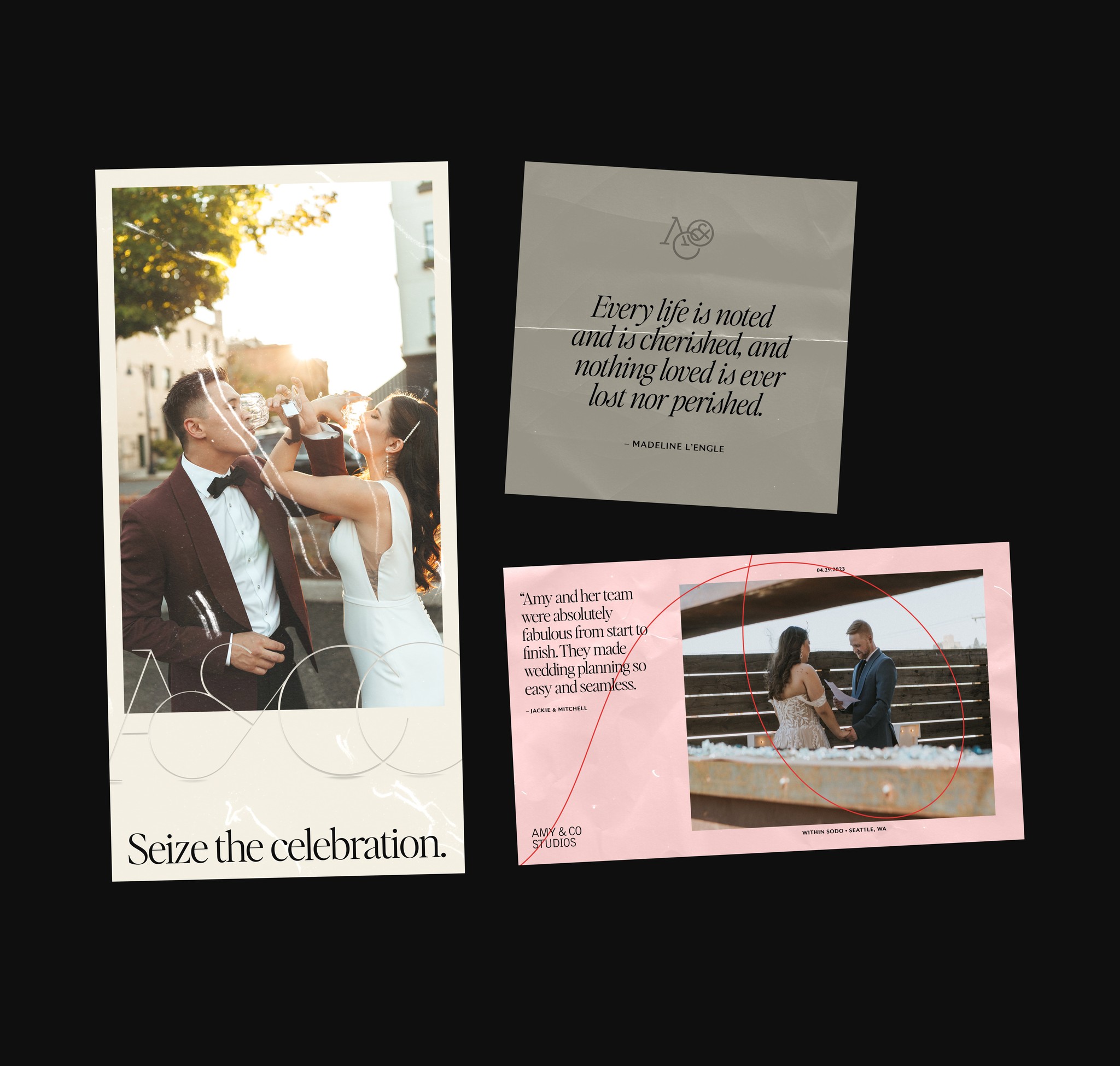
Art Direction looks a little different when it comes to wedding and event planning. Where normally one could pitch a specific editing style, composition set-up, or environment for the shoot, this industry defaults to whatever photographer the couple has decided to partner with for their day.

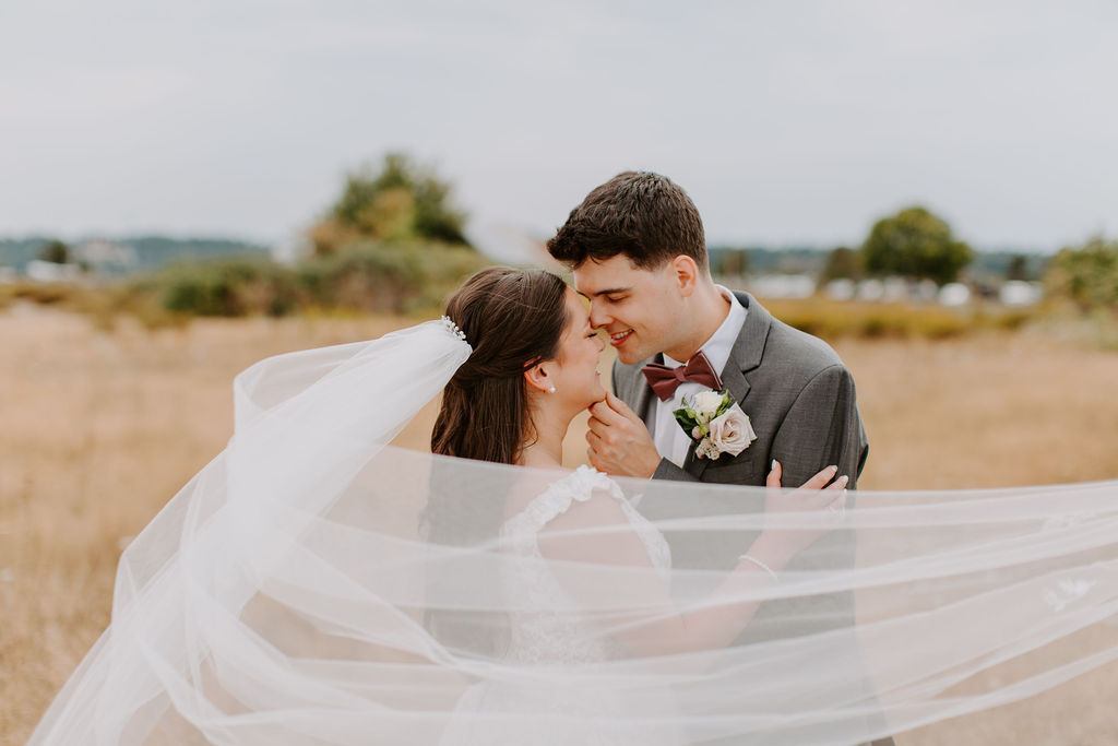
For Amy & Co I used the art direction treatment as a means to explore the concept of time in love. By leveraging various paper texture overlays I was able to create a "scrapbook" effect. This not only provided the brand with a unique story telling element, but also helped create texture in digital spaces.

One of the most fun elements of the Rising Tide Travel brand is it's use of small badge illustrations. These were inspired by passport stamps and focus around a key landmark of the client's destination/or piece of content it was tied to. After the team landed on a brand direction, I built an initial batch of around 10 different locations each with two variations, the first following a more traditional passport stamp, and the second leaning into the postal stamp aesthetic.

  • JOSHY COLEMAN

  • Brand & Web Designer

Let's work

together

  • JOSHY COLEMAN

  • Brand & Web Designer

Let's work

together