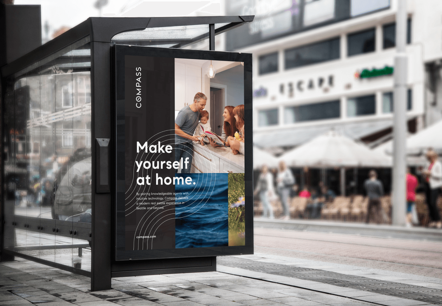
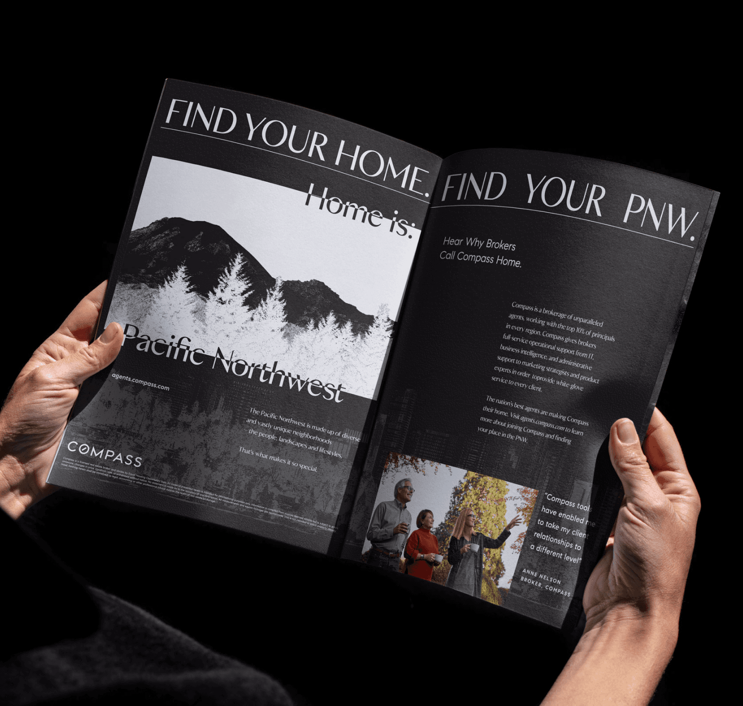
Joining Compass during it’s first full year of operation in Seattle meant jumping into the fray. Throughout that first year, brokers struggled with adopting the Compass brand. They felt it lacked localization, humanism, that warmth.
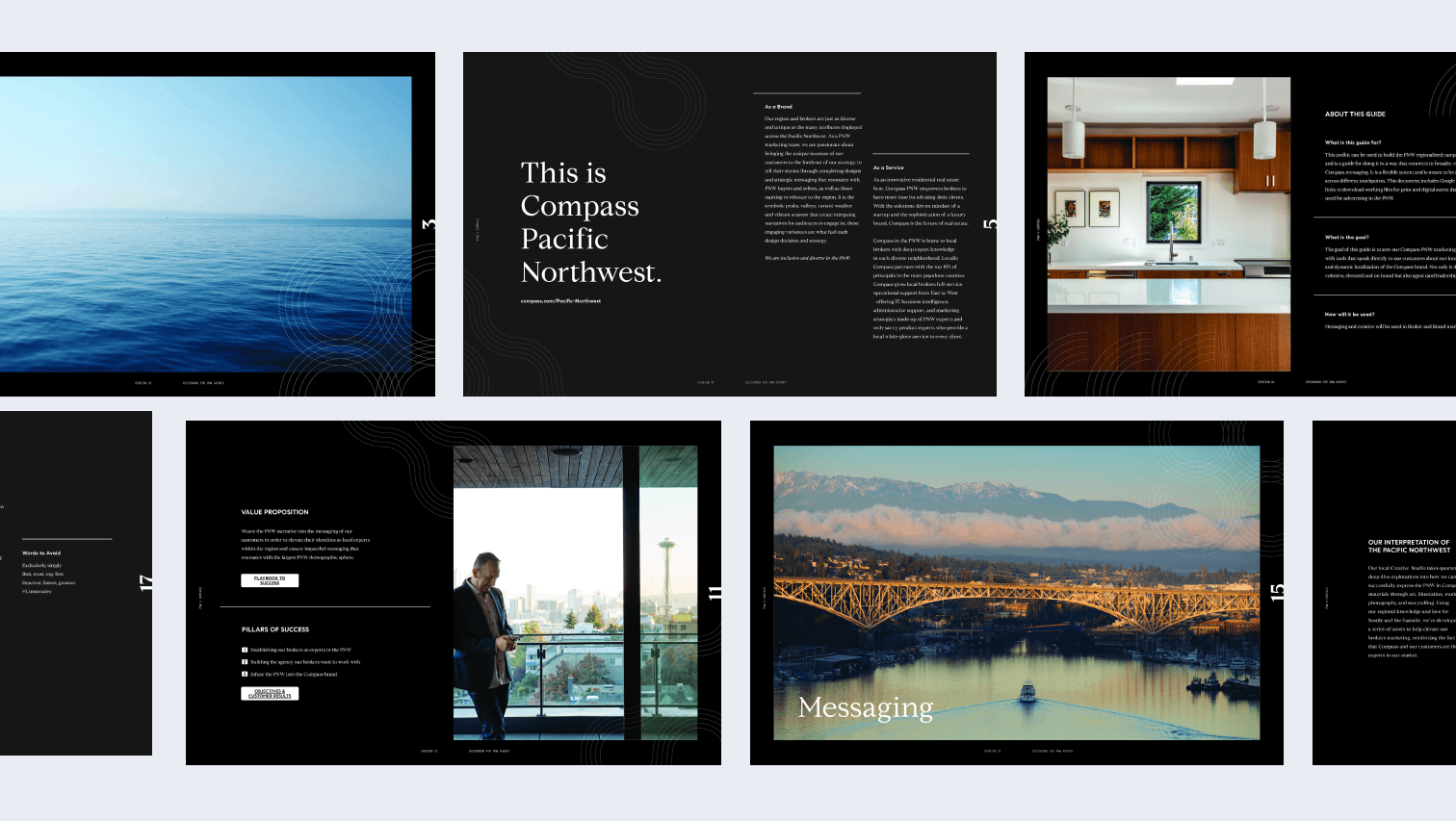
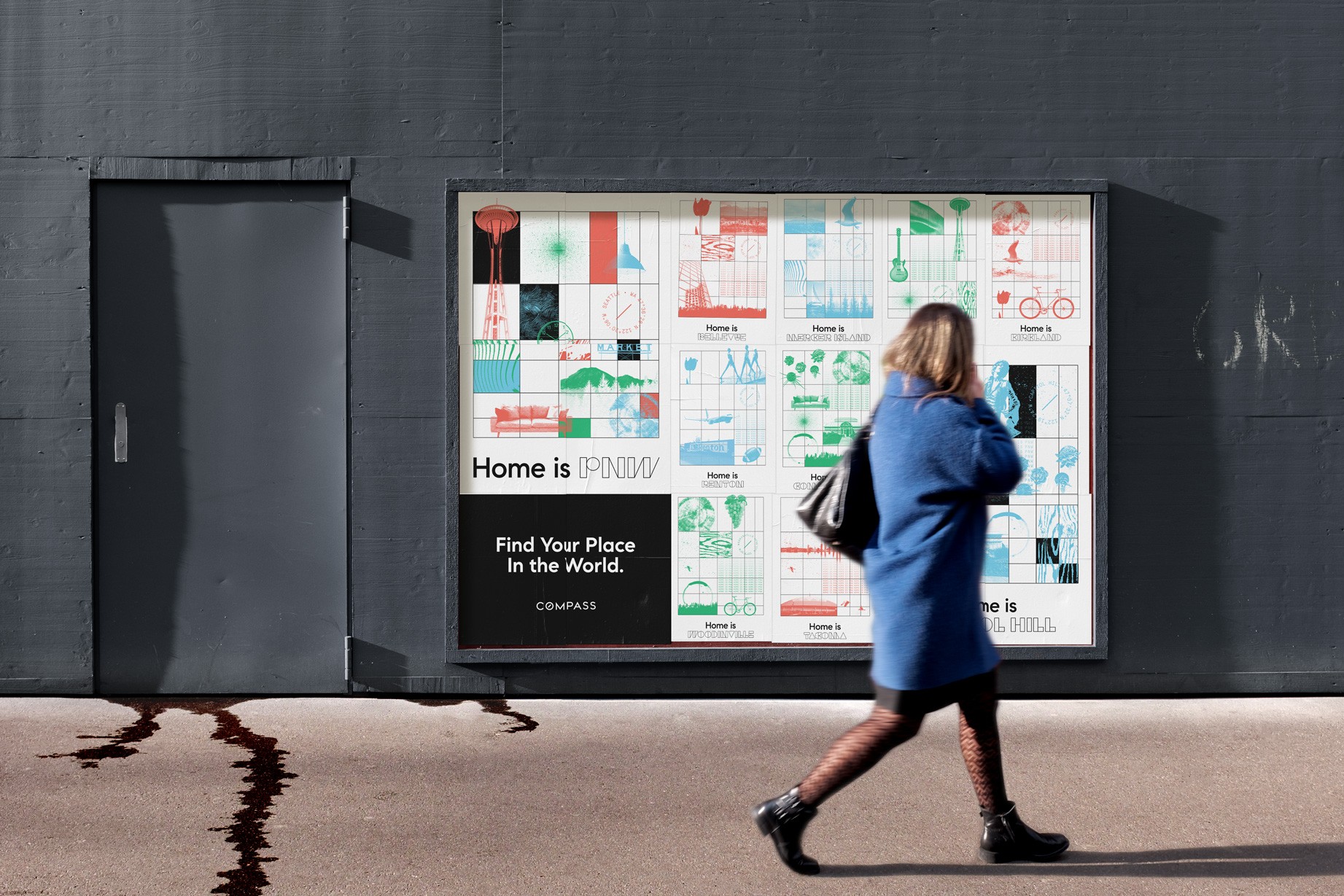
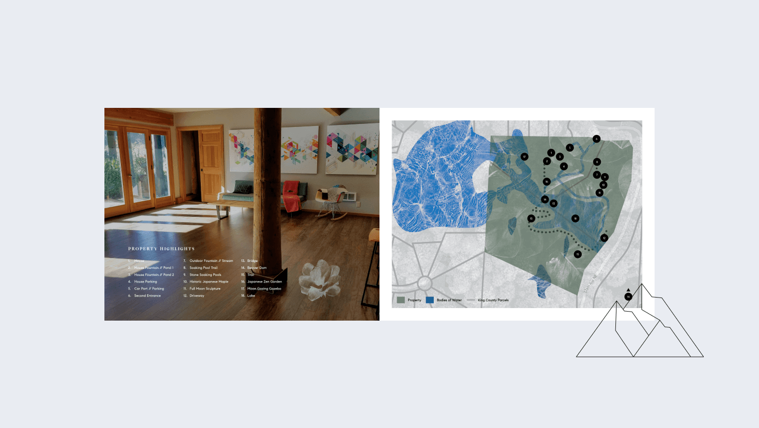
Right before we headed into 2020 our regional marketing director launched a brand expansion sprint where regional teams collaborated to expand the Compass brand into a more localized look and feel. This culminated in an art walk style exhibition where brokers were invited to come and vote on what specific elements and messaging they wanted to see brought forth into the new Compass PNW sub-brand.
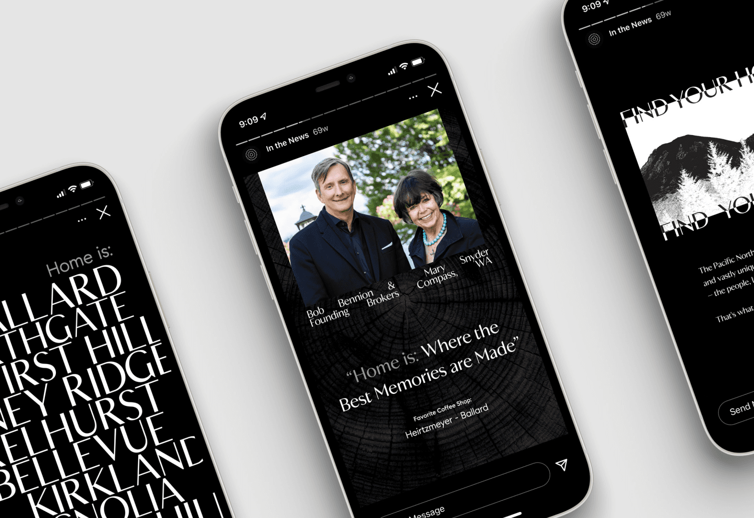
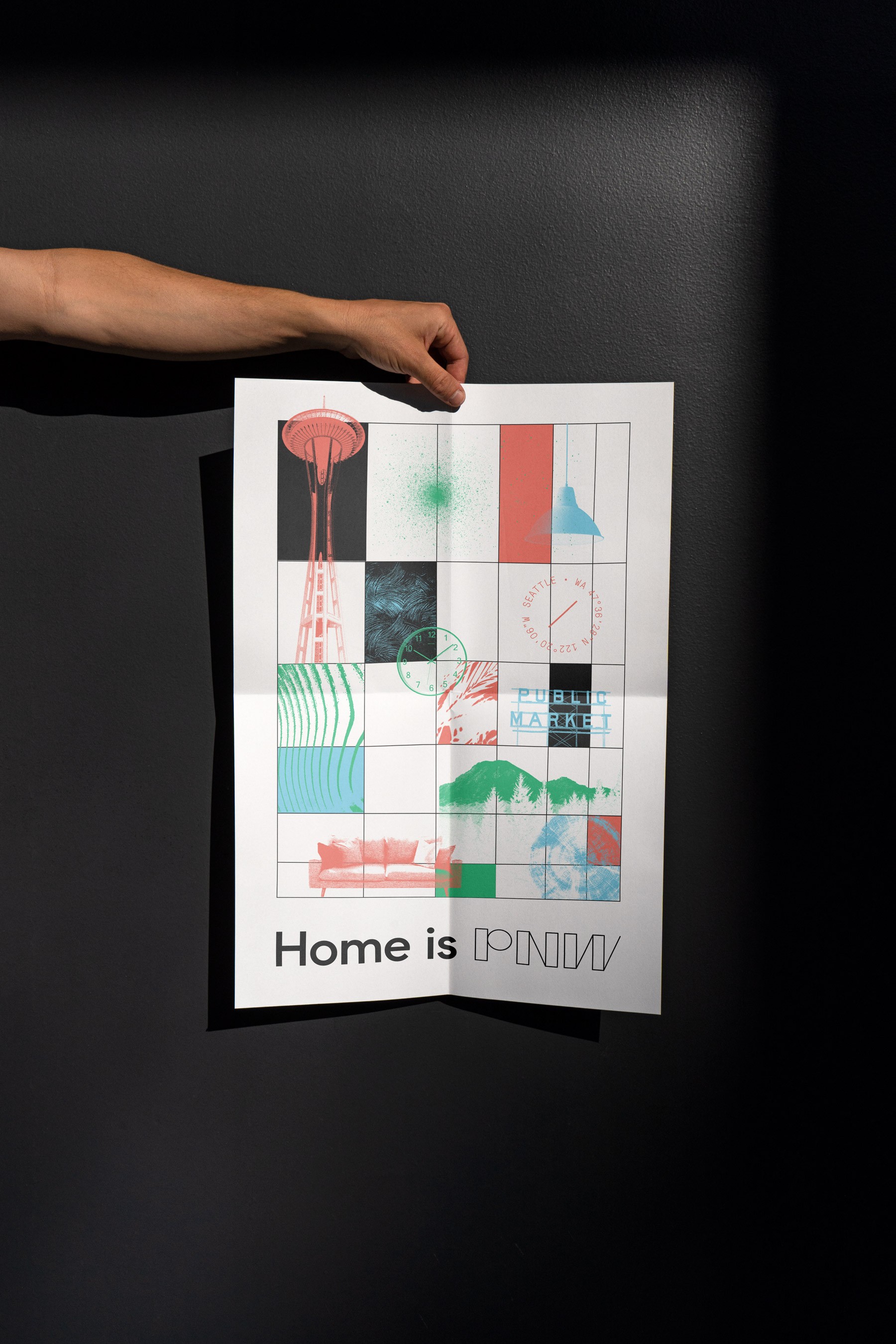
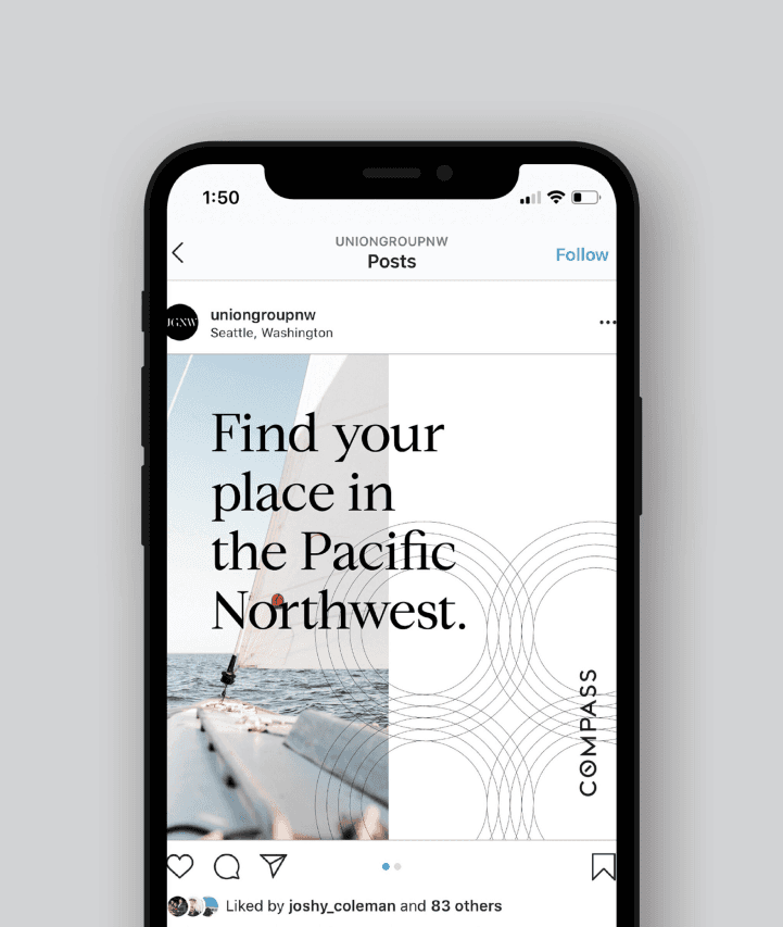
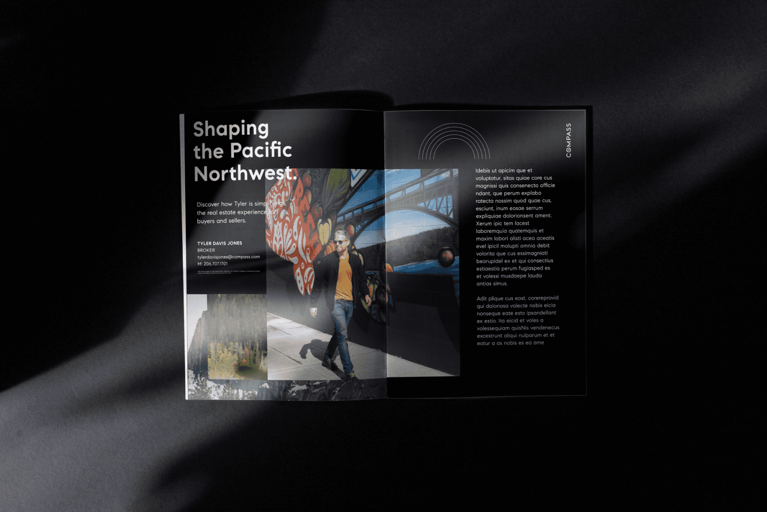
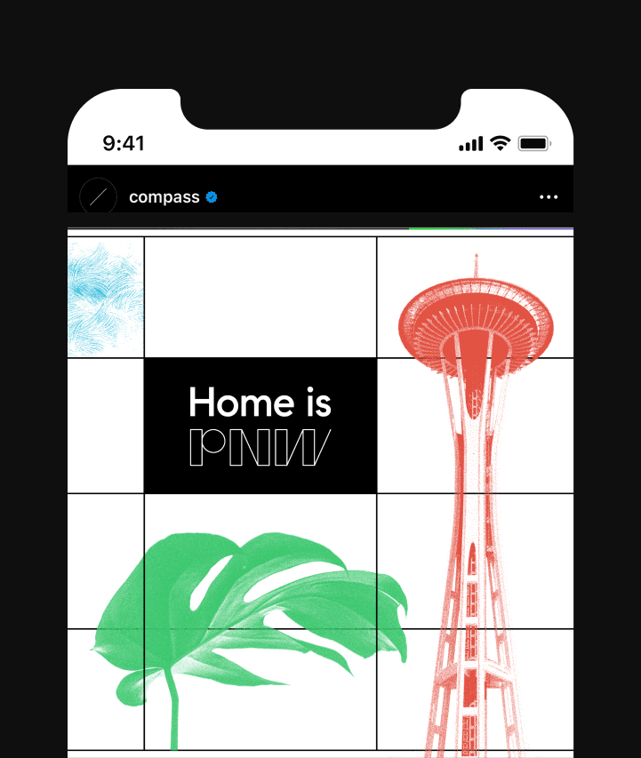
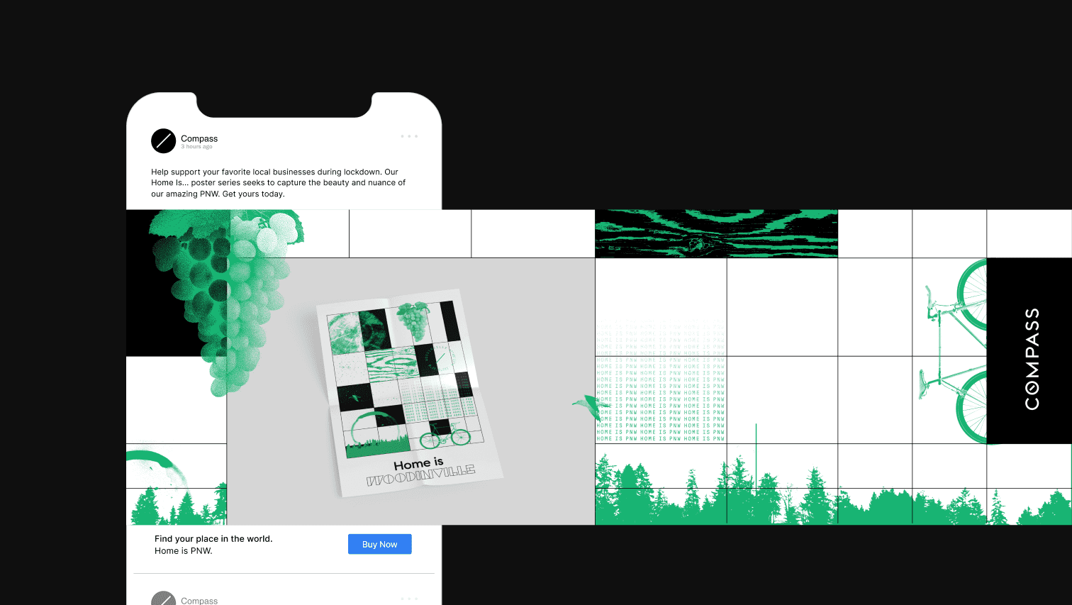
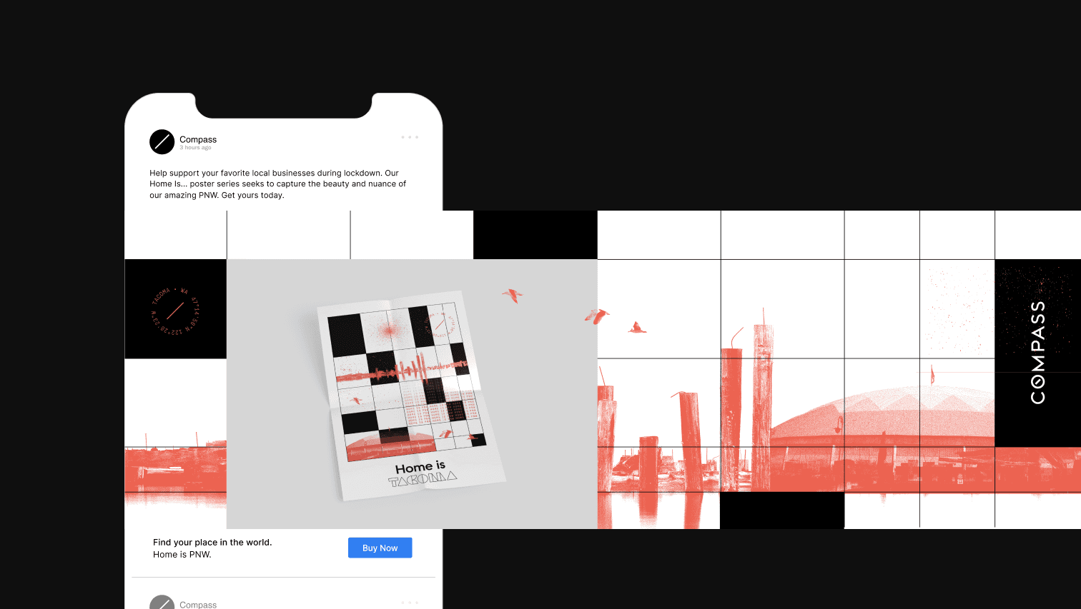
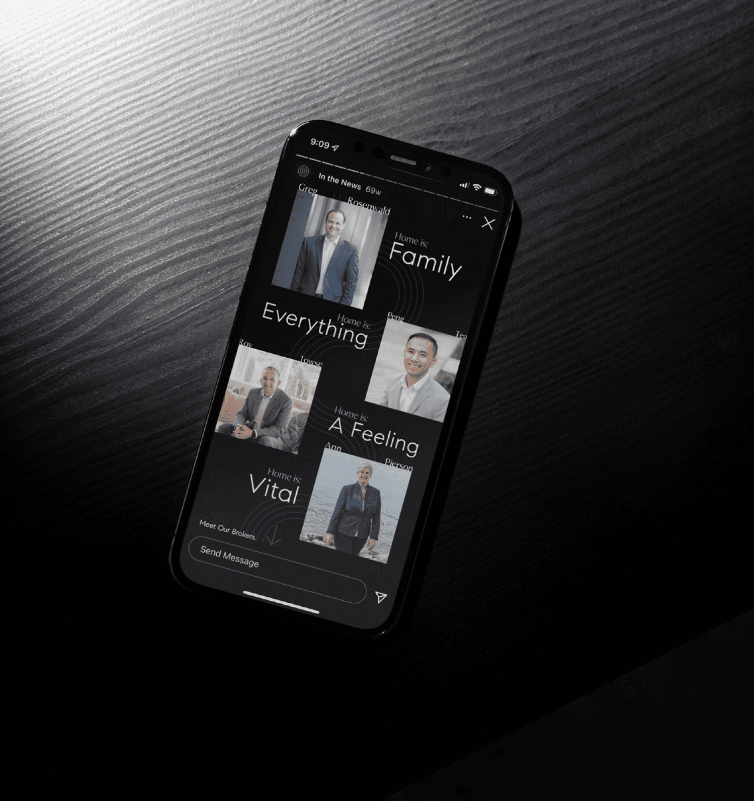
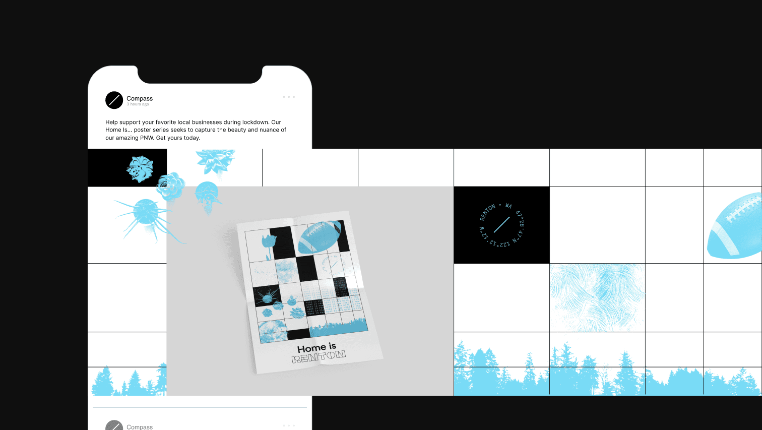
The culminating system was successful on multiple levels. It weaved the PNW into the fabric of the Compass brand, paying homage to key landmarks, textures, neighborhoods and the famous Seattle “eclectic” art style. Most importantly it won over some of our most important/high performing brokers into brand adoption and provided them new and vibrant ways to showcase their listings thereby increasing brand awareness locally.
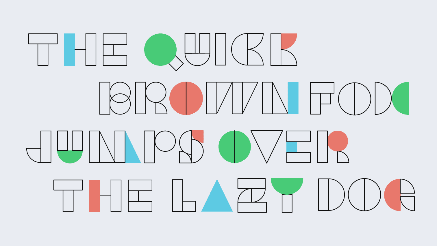
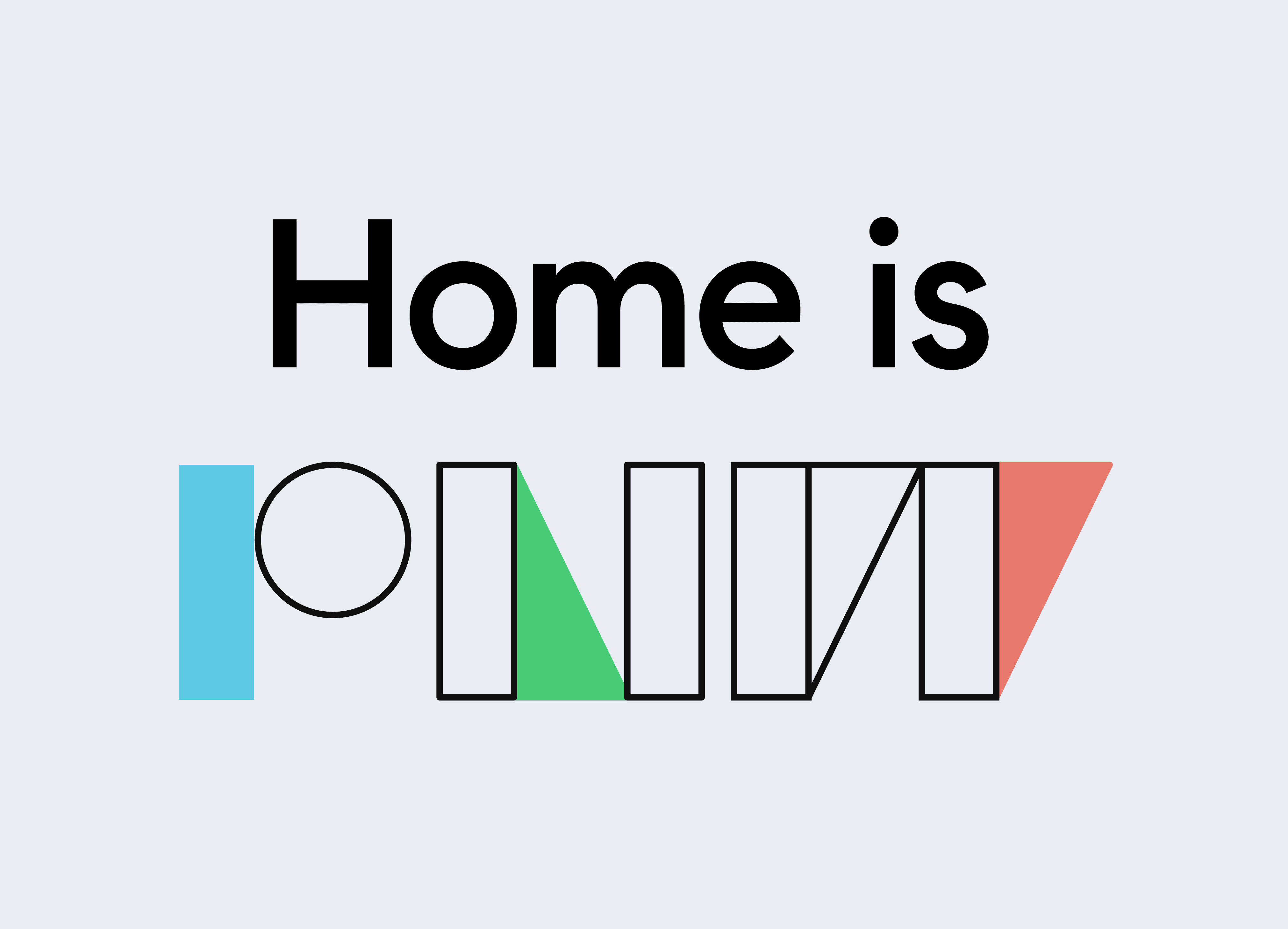
/Typography
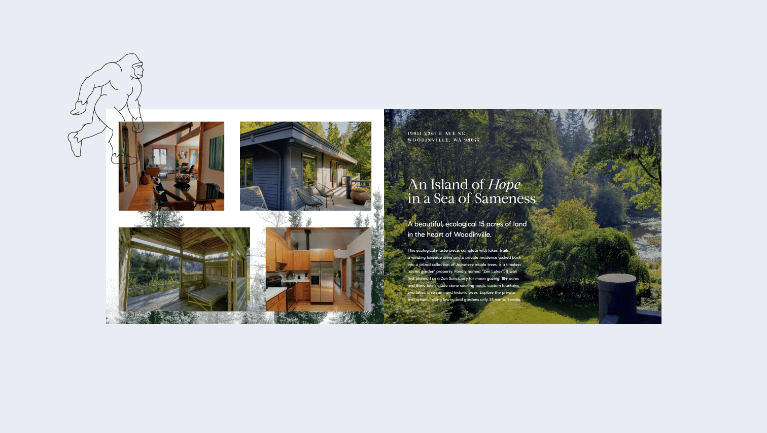
/Illustration
Over the course of 2019, I became locally known as our in-house icon designer. Having done a previous suite of icons for an agent, I thought leaning into PNW specific icons was a fun and unique brand moment. Agents could leverage these icons in a myriad of ways and they capture the nuance that is Seattle.
/Pattern
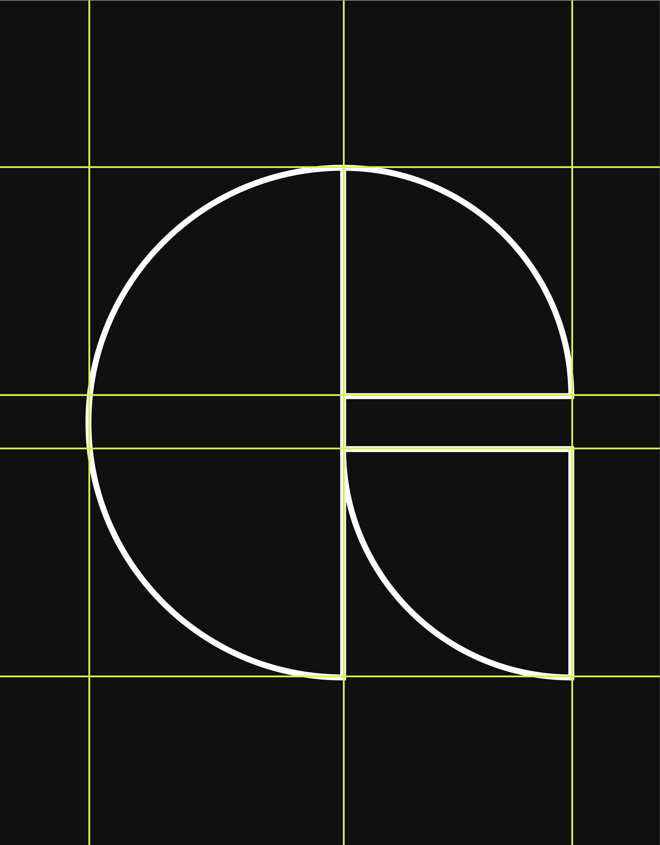
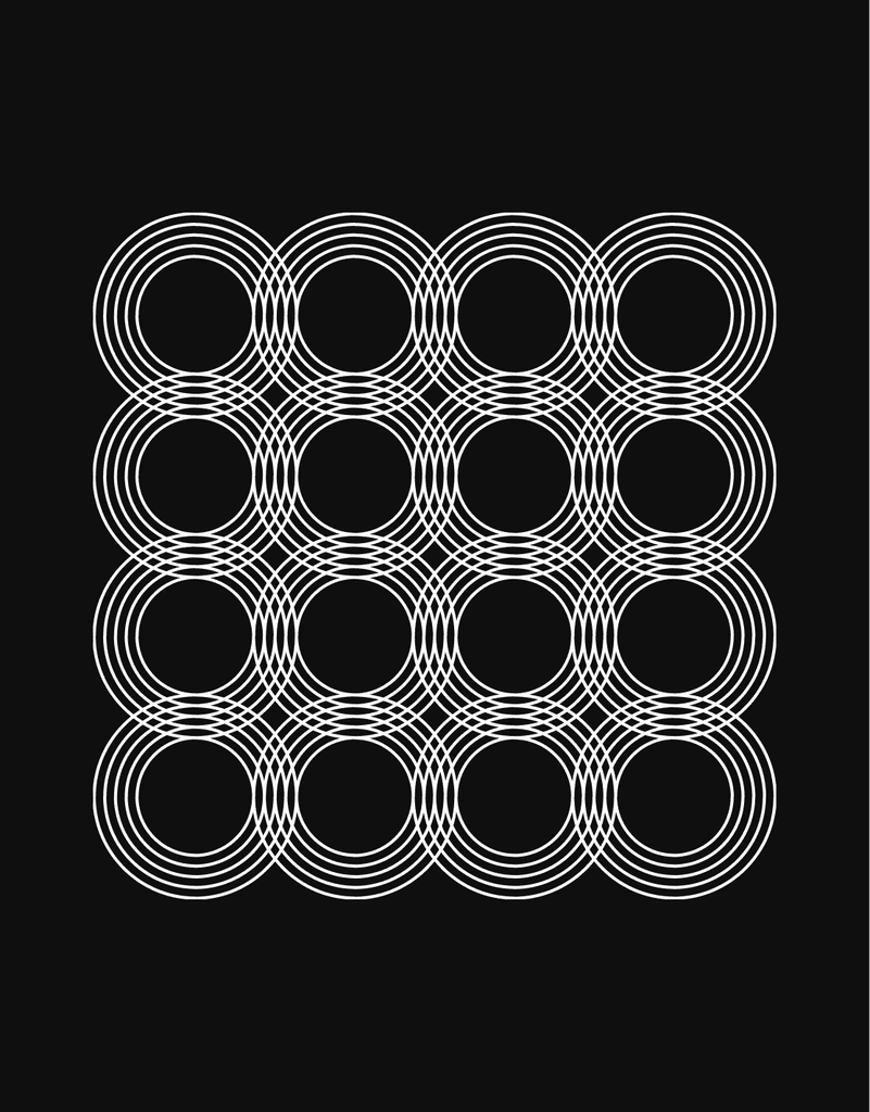
Seattle, and the PNW at large is a melting pot of unique and diverse people from all walks of life. Using this as inspiration I began playing with texture and pattern as a story telling device. Thus, four hero patterns were built using the beloved Compass geometry system:
/The WAVE
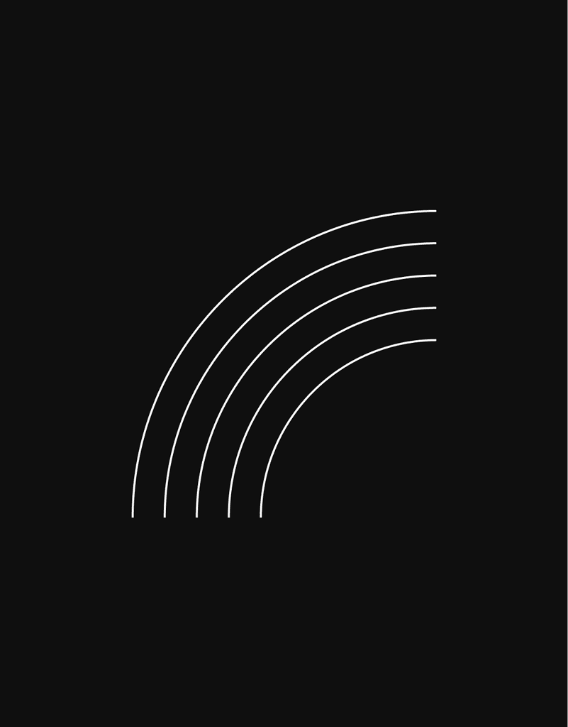
Seattle and the PNW is surrounded by water. In terms of business at Compass, the most beautiful photography often comes from listings that face the Puget Sound, or one of our many lakes. To capture this key land feature, we have the start of our pattern - ‘The Wave.’
/Love is love
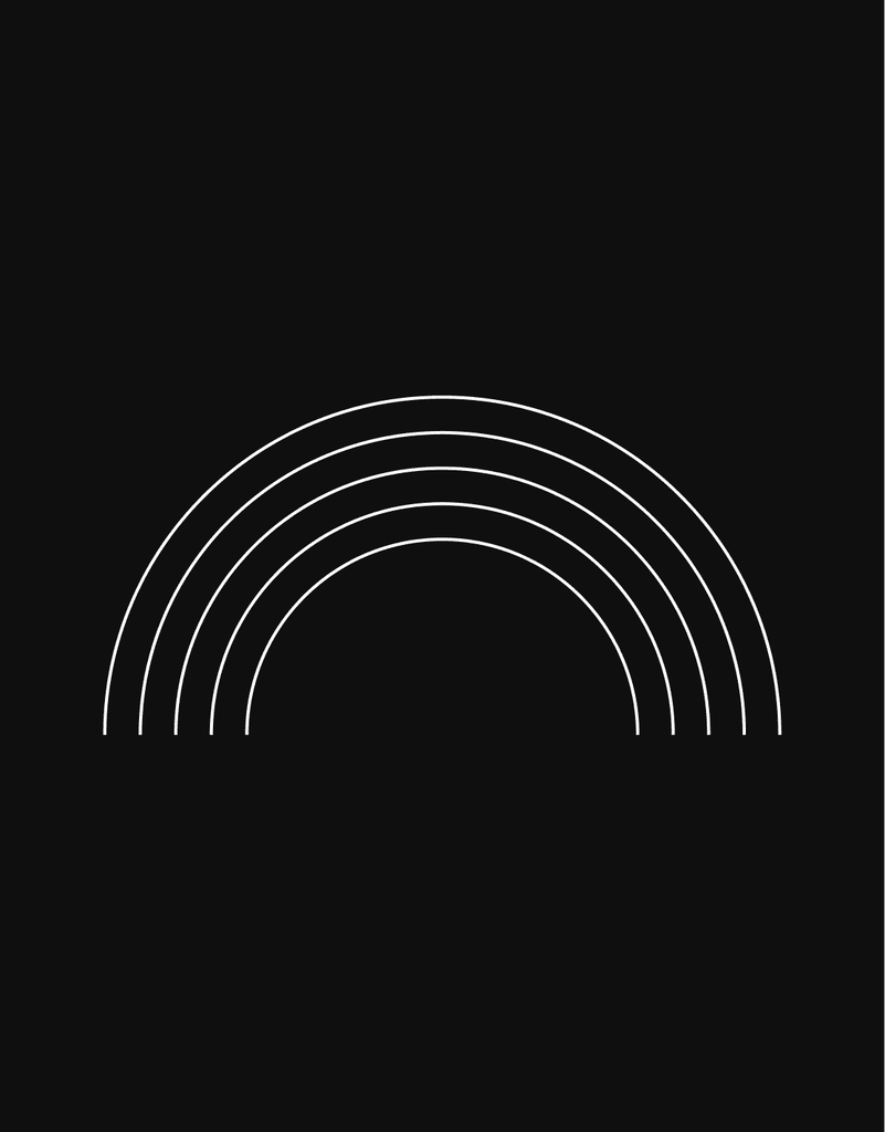
It is no secret that Seattle is one of the most friendly and vibrant LGBTQIA+ communities. Identifying as a gay man myself, I knew I wanted to bring this key communal feature into the brand expansion. Narratively, ‘The Wave’ duplicates upon itself to form a rainbow pattern that I called ‘Love is Love.’
/The RIVER
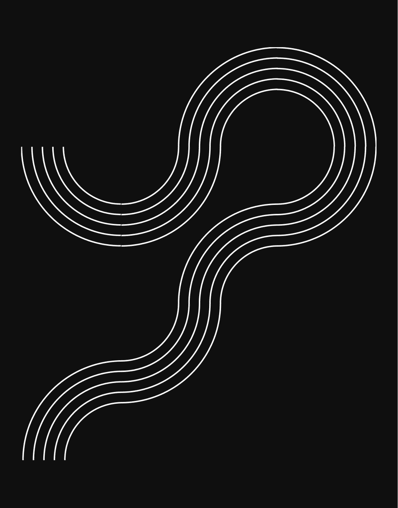
One of the more well-known characteristics of Seattlites is our love of the outdoors. Seattle is centrally located to amazing excursions, trails, and areas. To capture this wanderlust and love of the outdoors ‘The Wave’ once again duplicates, or triples, and folds in on itself to form ‘The River.’
/The Mixtape
Music is strong heartline of Seattle. Headliners like Pearl Jam, and Nirvana are forever engrained into it’s history. To capture this fervent love of music, ‘The Wave’ and can be duplicated and reflected to form the shape of a vinyl in which the user can use in a singularity or in multiples to form ‘The Mixtape.’
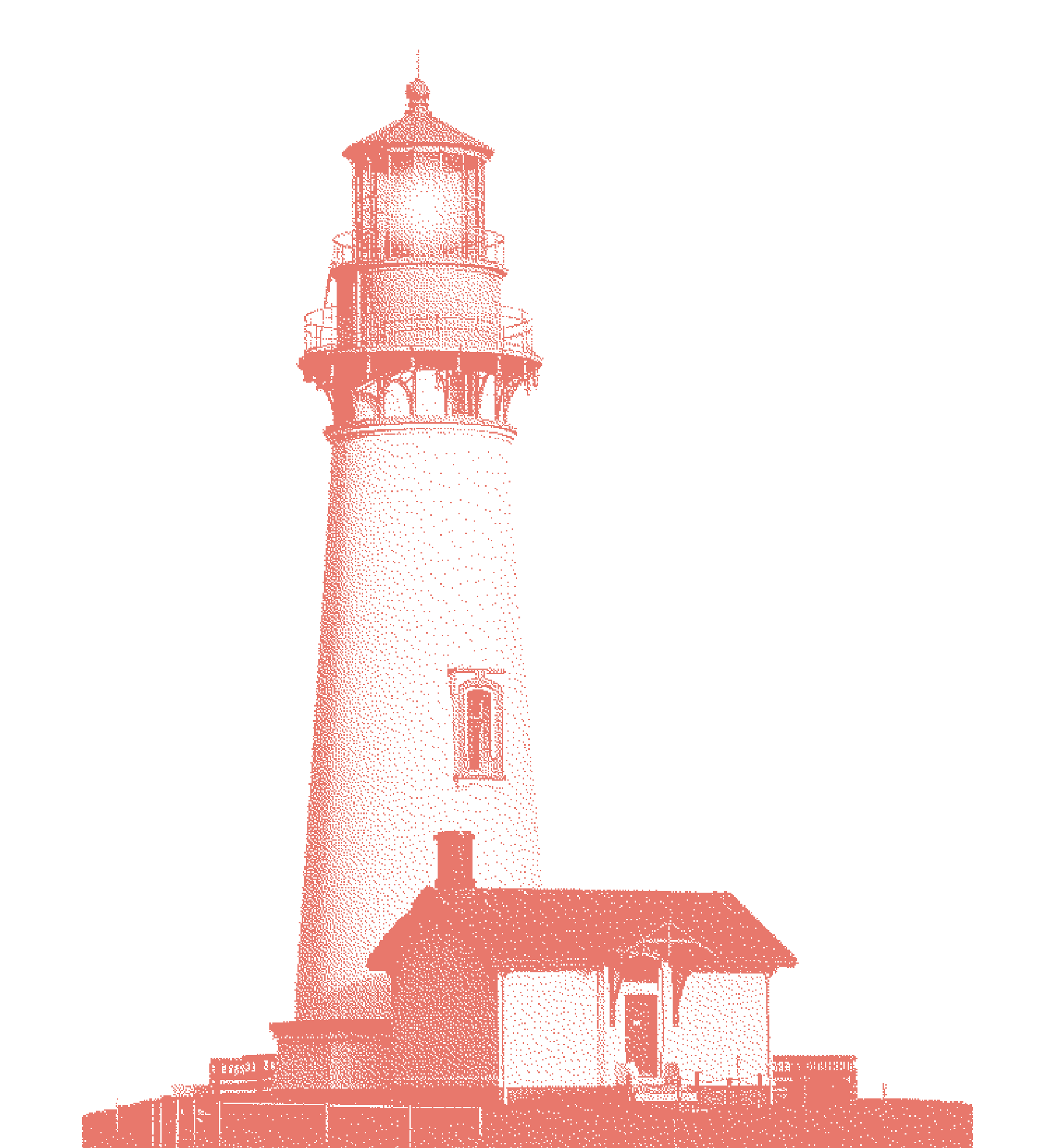
/texture of the PNW
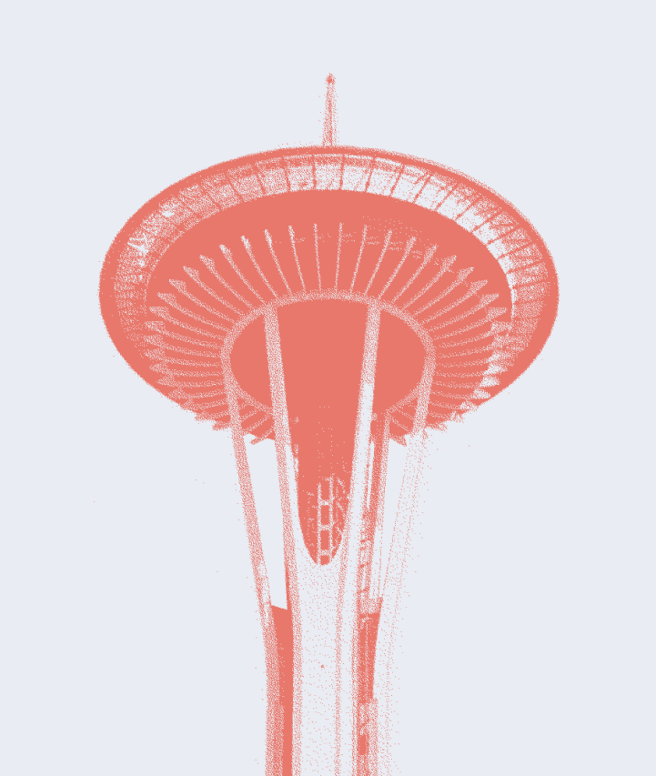
Given that photography is such an integral part of the Compass brand system, the team thought it was imperative to introduce a treatment. A senior designer on my team pitched, what he referred to as “TIFFing,” in which took an element and converted it to a bitmapped tiff that we could recolor and use throughout collateral and activations. Once he left Compass, I inherited and expanded this library.
