joshy coleman

SENIOR BRAND & WEB DESIGNER

[MENU]

joshy coleman

[MENU]

Compass

Compass

Compass

Pride 2021 Digital Campaign

Pride 2021 Digital
Campaign

Pride 2021
Digital Campaign

2021
2021
2021
BRAND DESIGN
ART DIRECTION
ILLUSTRATION
CAMPAIGN
BRAND DESIGN
ART DIRECTION
ILLUSTRATION
CAMPAIGN
BRAND DESIGN
ART DIRECTION
ILLUSTRATION
CAMPAIGN
ROLE
ROLE
ROLE
LEAD DESIGNER
LEAD DESIGNER
LEAD DESIGNER

/Over-

View

/Over-

View

At Compass, PRIDE is one of the most celebrated and engaged with brand awareness campaigns of the year. The 2021 PRIDE season was a unique one; not only was it one of the first “back in public” celebrations after the pandemic, but both the Black Lives Matter and Transgender movements were also happening.

On a corporate level, Compass had just launched it’s Canva alternative revamp of a beloved agent product called “Marketing Center” and the executive team was heavily pushing product adoption to validate the investment of resources.

/Solu-

tion

/Solu-

tion

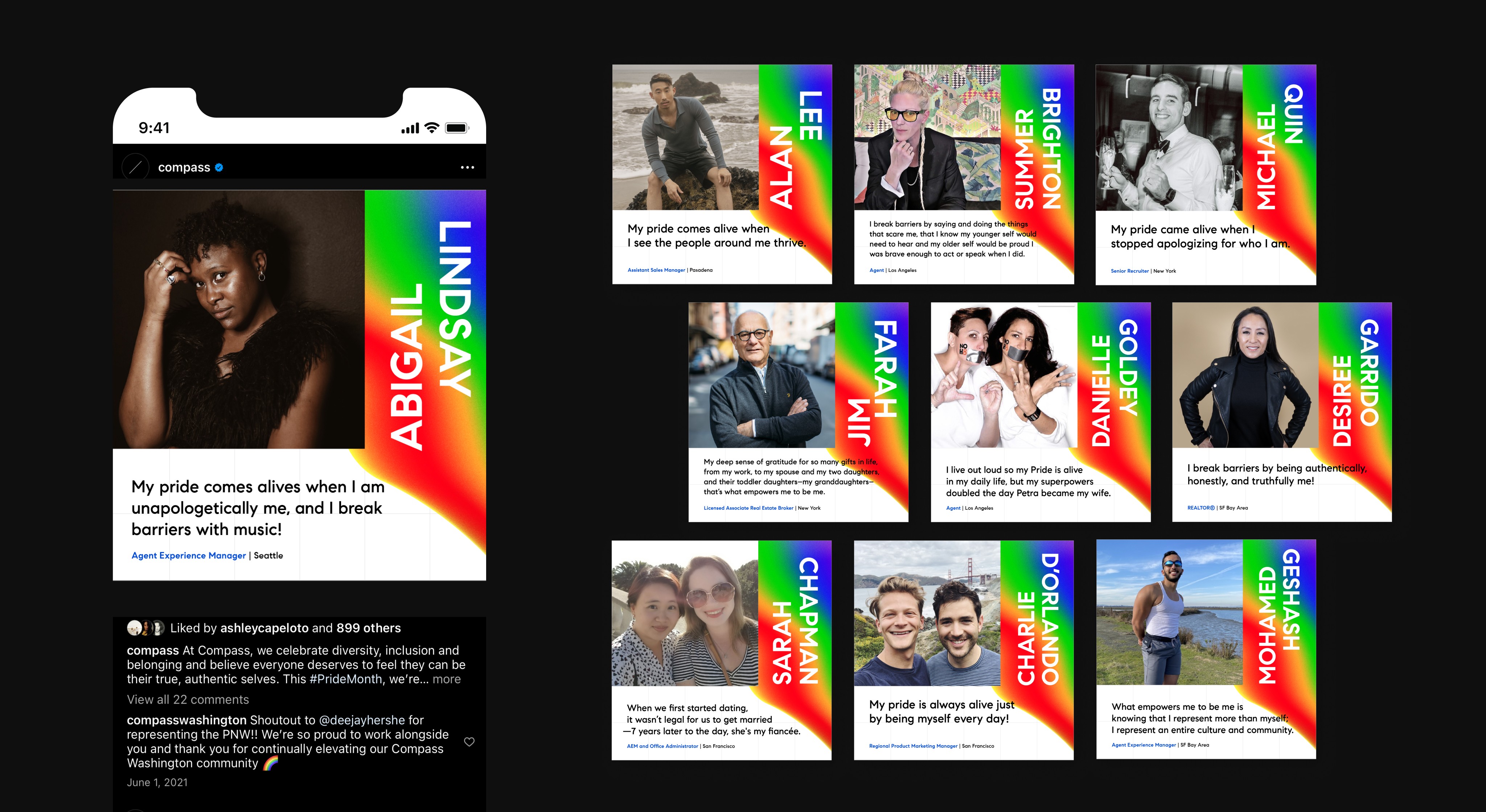
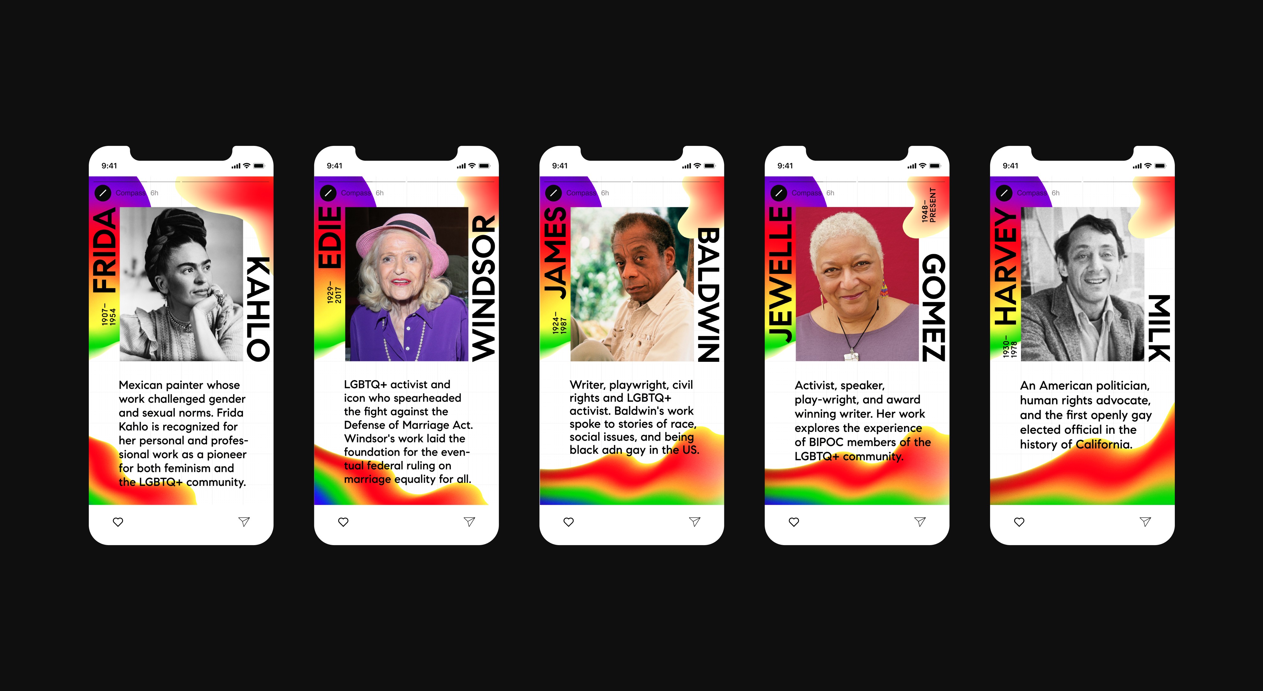
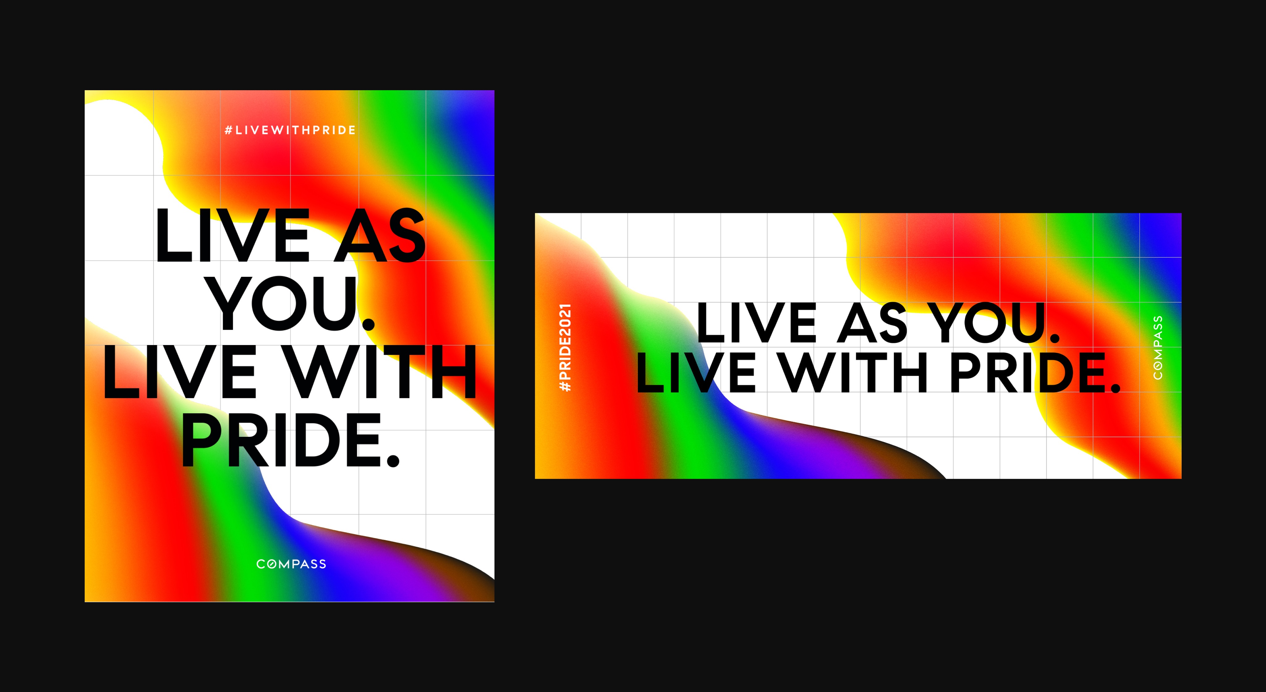
A multi-channel digital drip campaign that empowered agents, employees, and the Compass brand to drive a celebratory message of inclusion, allyship, individuality,

and education during the PRIDE 2021 season.

/Inspiration

Sometimes inspiration strikes us when we least expect it. That, to this day, has never been more true than it was for this campaign. After struggling for the better part of two weeks I was struggling to throw together a direction to present to our brand team for consideration.

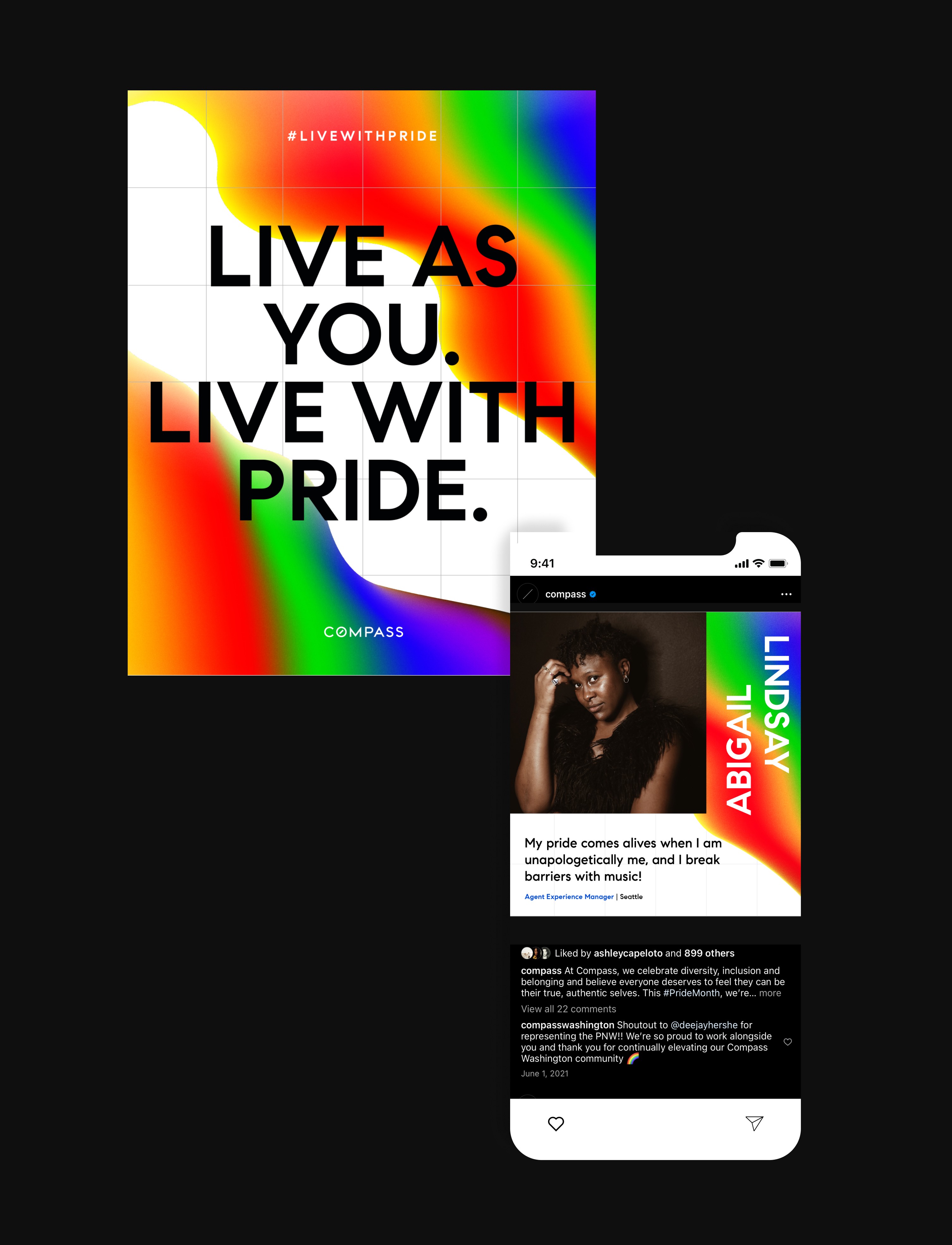
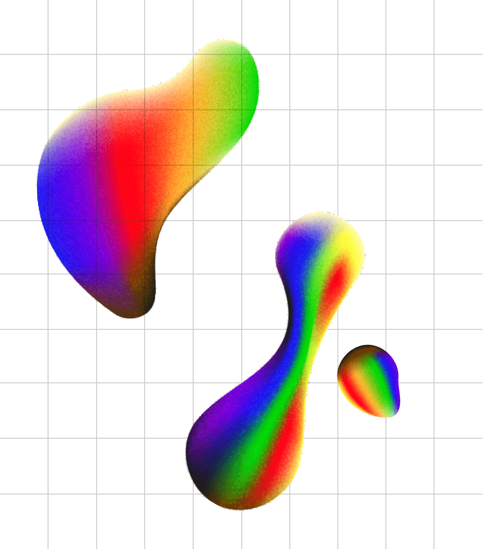
Then, it hit me. On the precipice of giving up I decided to play a childhood favorite video game of mine, Super Mario Sunshine. While playing, I realized that the game's heavy paint motifs could be a narrative tie to the concept of gender and identity; a symbol of fluidity, beautiful and unique non-conformity.

Because the bulk of this campaign was built around these organic paint swatches (or gobules as I called them) I leaned into Compass's Swiss structuring. I drew heavy inspiration from the exposed grid trend of the time and thought it paired well.

/Typography

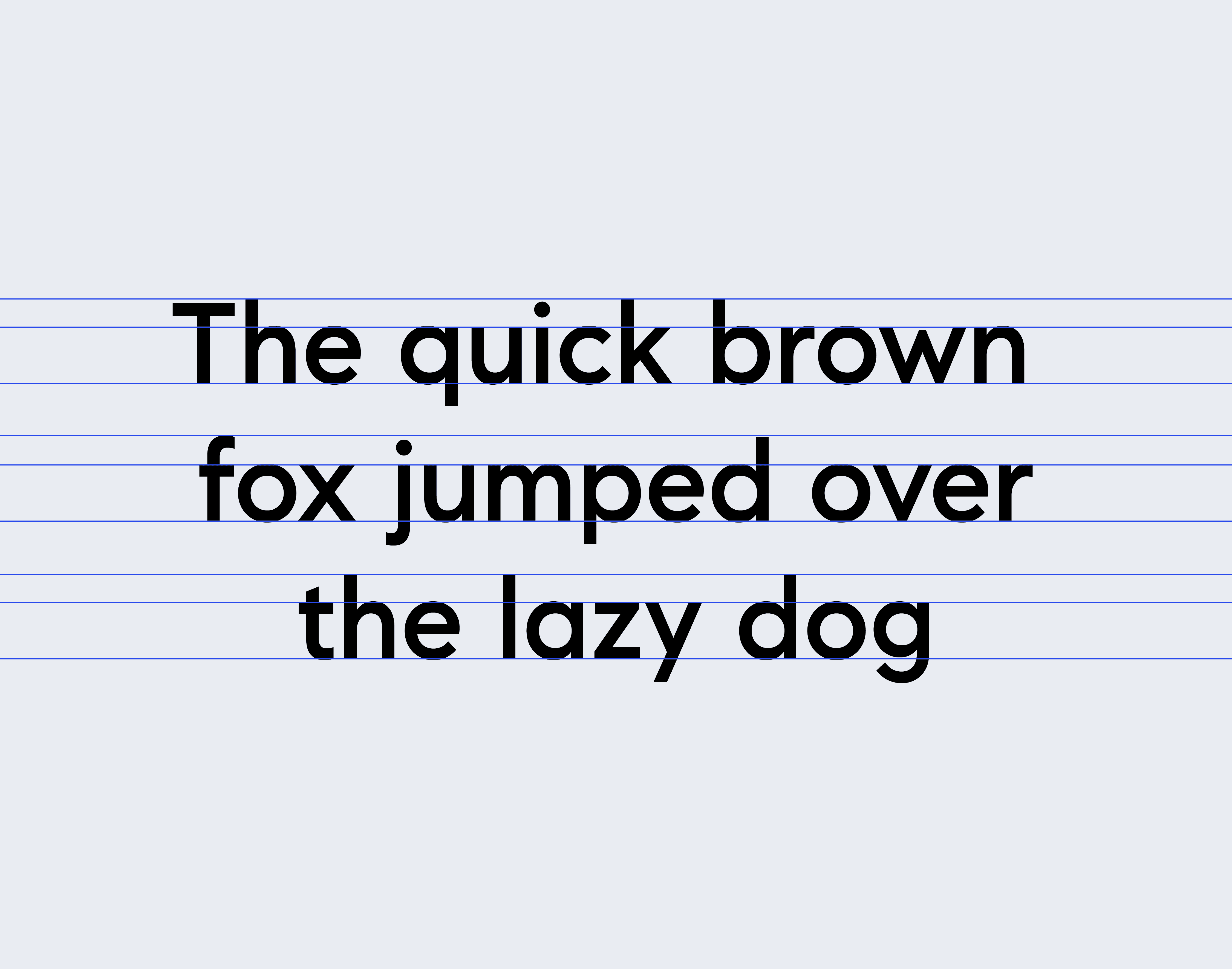
Compass has three typefaces native to it's visual identity. Taking the reins from it's Swiss Architecture gridding I leaned into 'Compass Sans,' a very geometric, yet quirky and human in it's own right. Additionally I leveraged typography and our messaging as artistic elements in of itself - often opting to rotate words and setting them in uppercase to help conduct a user's eye.

Compass has three typefaces native to it's visual identity. Taking the reins from it's Swiss Architecture gridding I leaned into 'Compass Sans,' a very geometric, yet quirky and human in it's own right. Additionally I leveraged typography and our messaging as artistic elements in of itself - often opting to rotate words and setting them in uppercase to help conduct a user's eye.

/Color Palette

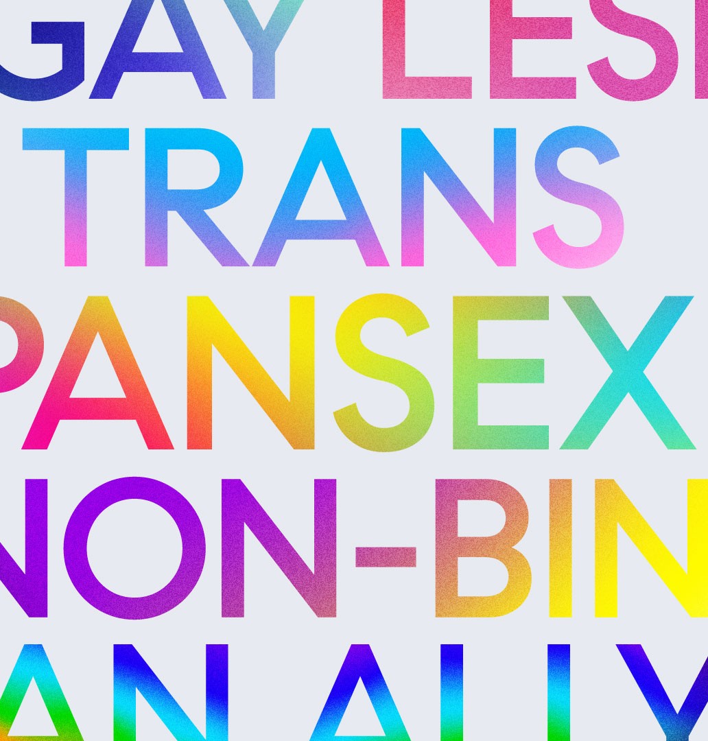
The color palette leveraged for the Pride 2021 campaign was adaptive in nature. A user could change what colors showed up on a piece of collateral they were building based on the gender or identity selected. This resulted in an expansive and robust set of colors to hit on our goal for inclusivity, but it also allowed an opportune moment for our brand team to see which colors and sets were being used most "in the wild."

With this data our team was able to use build a foundational starting ground in our efforts to expand the color system of Compass as a whole the following color. In regards to the campaign, the dynamic palettes I created within the paint swatches taught me how to think through guidelines more thoroughly than I ever had before as they needed to mimic and match a paints mixing structure. This is why on a lot of the hero collateral pieces, you see the colors present in a spectrum running from cold to hot.

/Accoutrement

By far the most important piece of this campaign identity is the story it seeks to tell. Sexuality and identity are not fixed, they are fluid. And the journey of discovering yours isn't always linear. It's often a cycle of peaks and valleys. This was the inspiration for what I dubbed as 'the weave;' a layering of the elements over and under the grid to more closely capture the journey to radical self acceptance. While a more small detail, its the one that brings the collateral most to life.

To help aid with this dynamic texturing, I also opted to use film grain as a means to shade the globules. Working with such complex gradient meshing, I found that applying straight black or brown to the more colorful palettes could sometimes create a muddy texture. The grain helped ground this, and helped dillenniate the foreground from background.
  • JOSHY COLEMAN

  • Brand & Web Designer

Let's work

together

  • JOSHY COLEMAN

  • Brand & Web Designer

Let's work

together