Reforge is a Series B ed-tech start-up based out of San Francisco. It leverages tech industry leaders to instruct cohorts and programs using anecdotal and case study based lessons on topics in engineering, growth, product, and marketing.
Up until March of 2021, Reforge’s success was attributed entirely
to organic growth. Upon getting hired I collaborated with our growth, insights, and content teams to stand-up paid media over the course of 9 months.
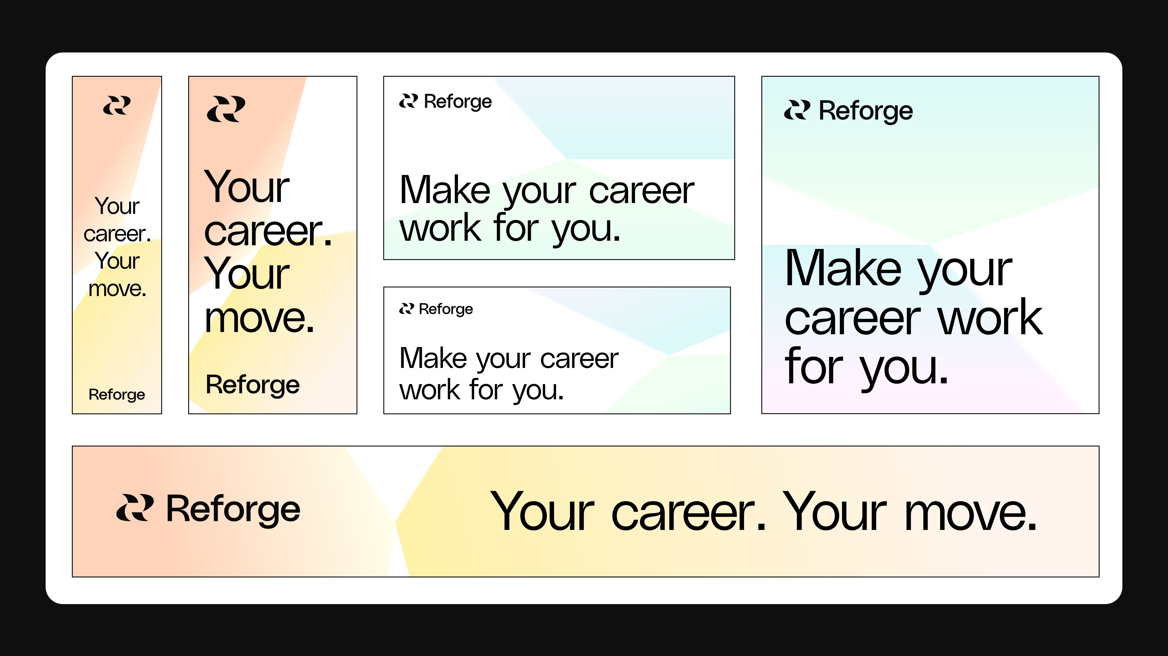
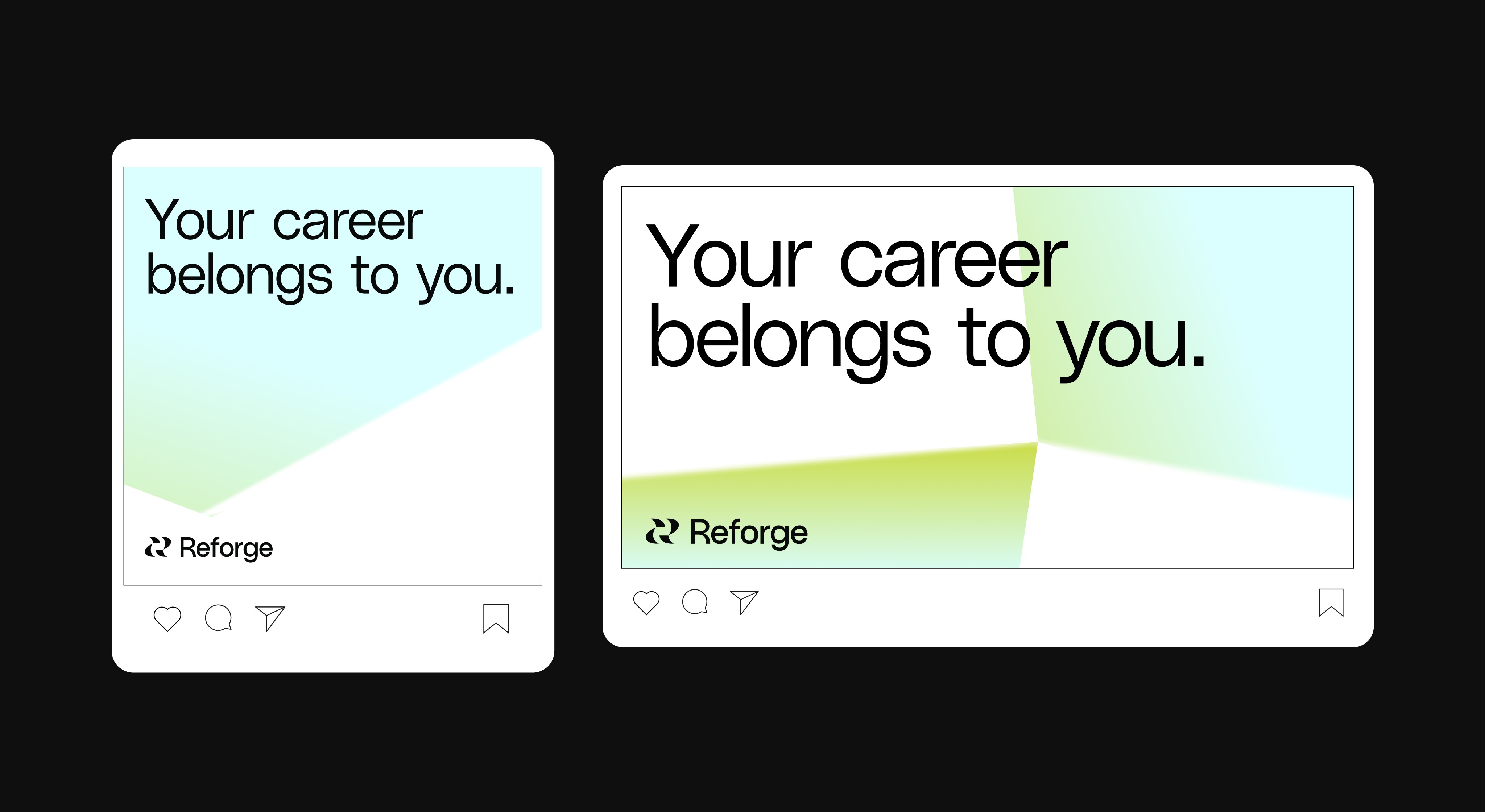
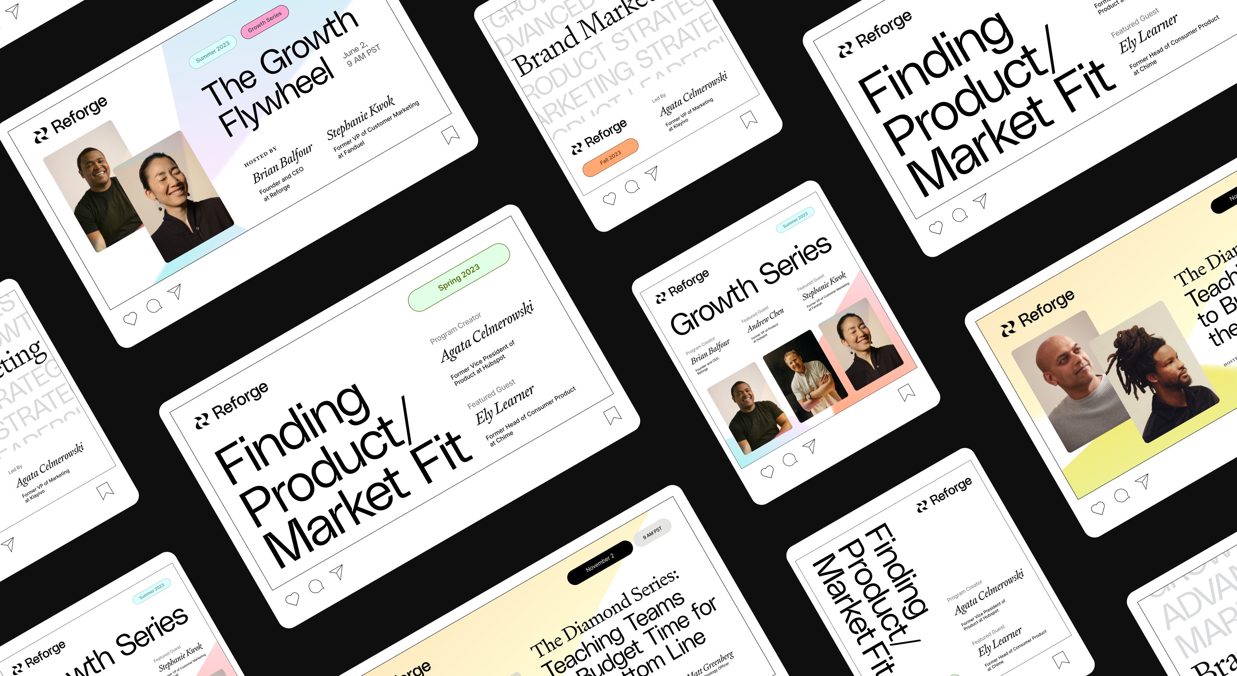
Over a year, paid media experimentation was executed in three phases, each with its unique visual feel and trying to test different things to best establish product market fit. Through systems upstarting (such as Figma libraries, stock photography repositories, and other brand asset archives) the team was able to move quickly and iterate. This experimentation stand-up culiminated in the form of rebuilding the most successful media ad styles to reflect the Koto rebrand that was just completed.
/Phase I: Paid mEdia Launch
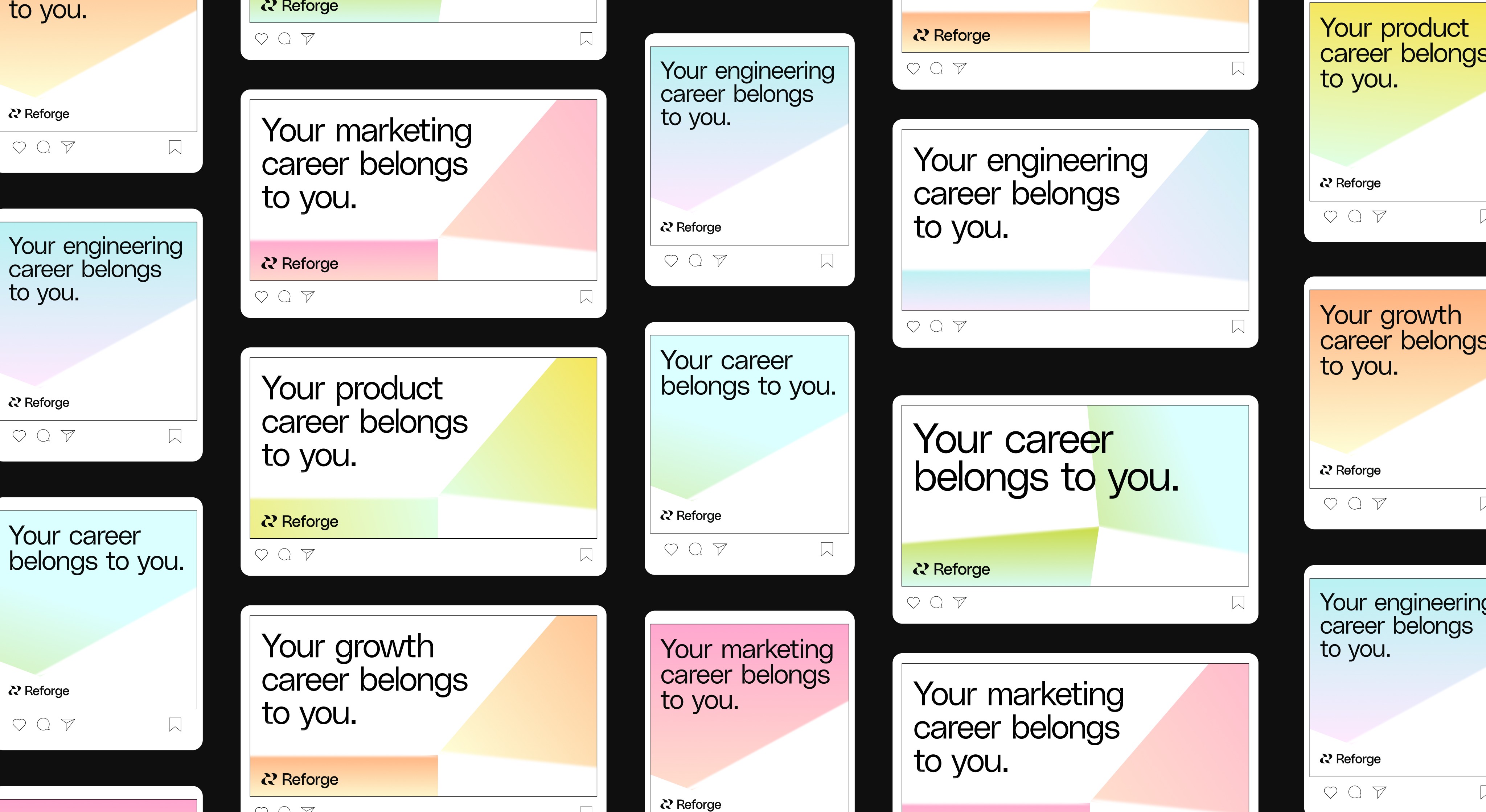
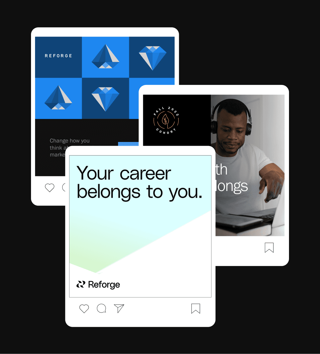
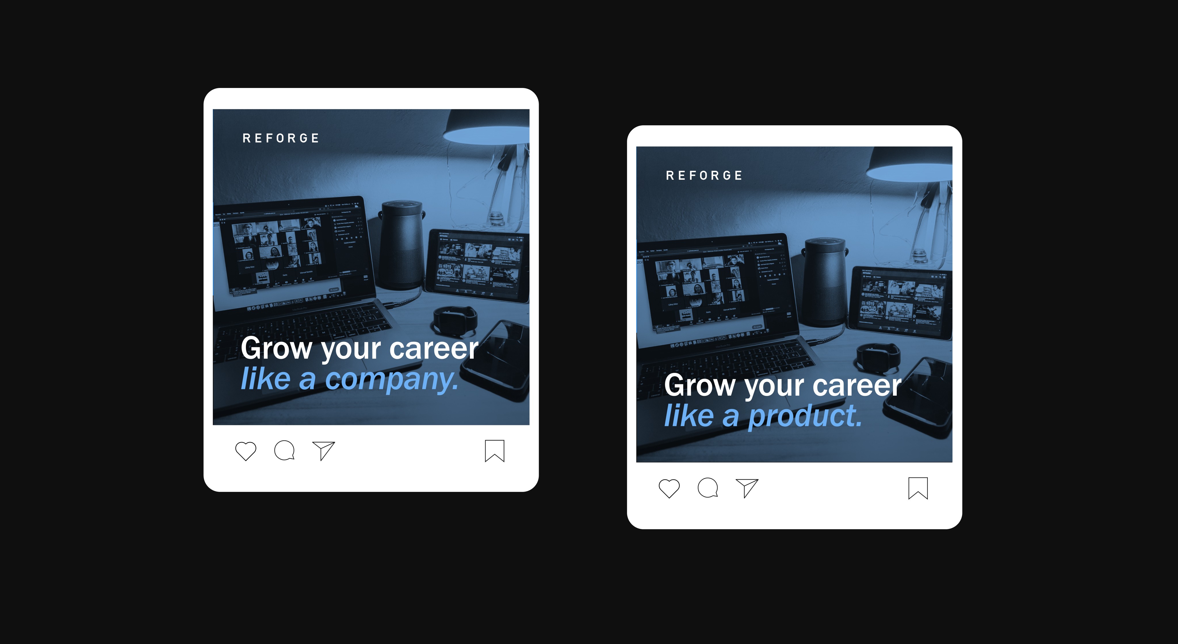
Upon first being hired at Reforge as the team's Senior Brand Designer, I was tasked with helping our growth team begin the paid media expansion testing. For Phase One, we were aiming to test silo'd content ads that were specific to a niche that a potential member could find within a Reforge Cohort (i.e. Marketing, Growth, or Engineering.)
When approaching this initial stand-up, I wanted to bring a more vibrant/tech-forward style to the way we built external member collateral. The design push in this phase was more about unification and building a stronger brand presence.
/Phase II: PRE-REBRAND EXPANSION
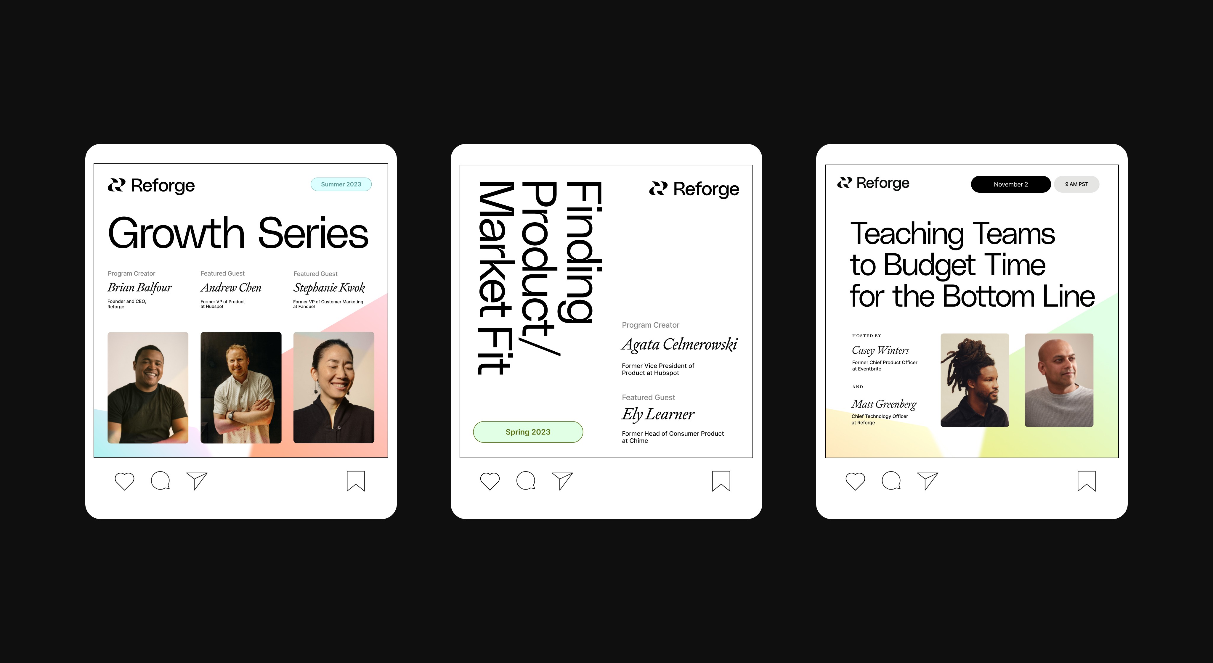
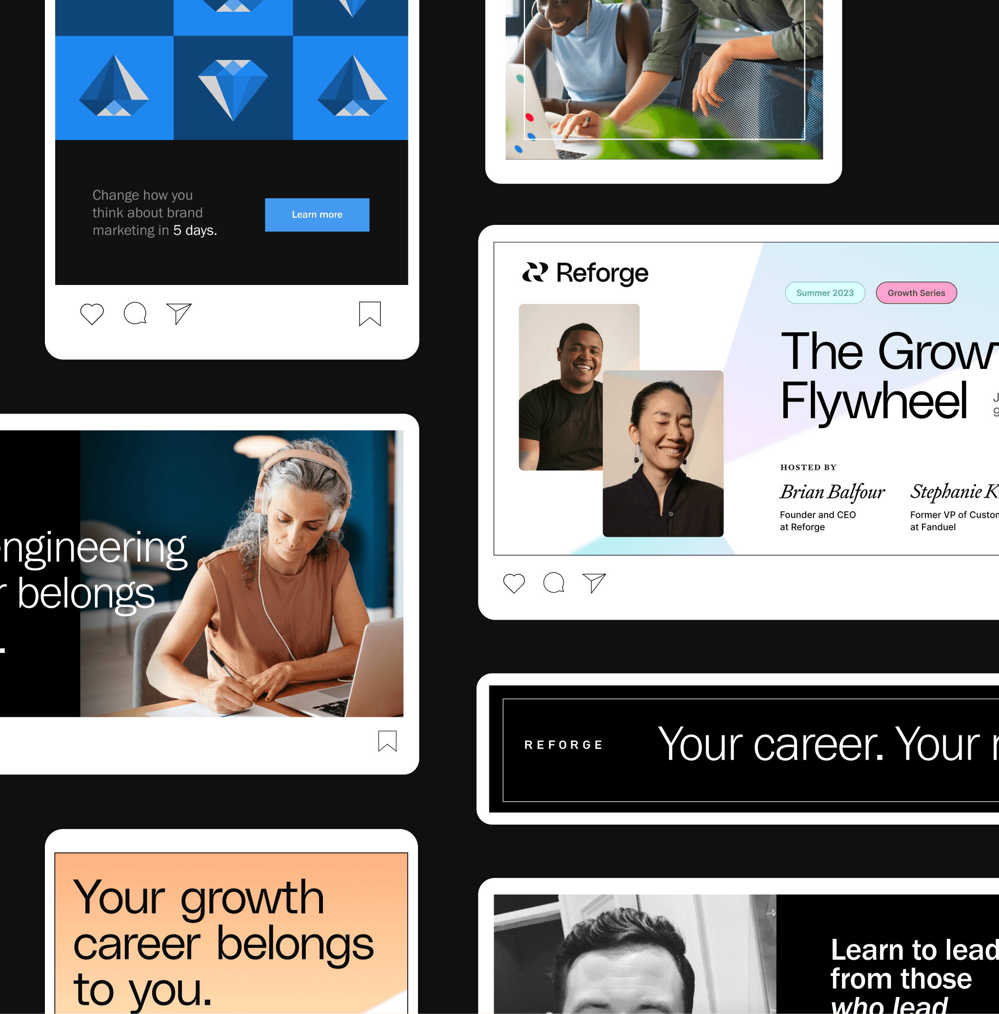
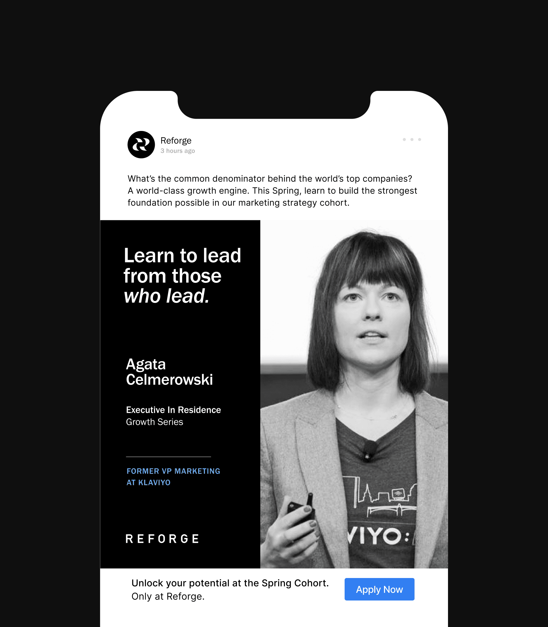
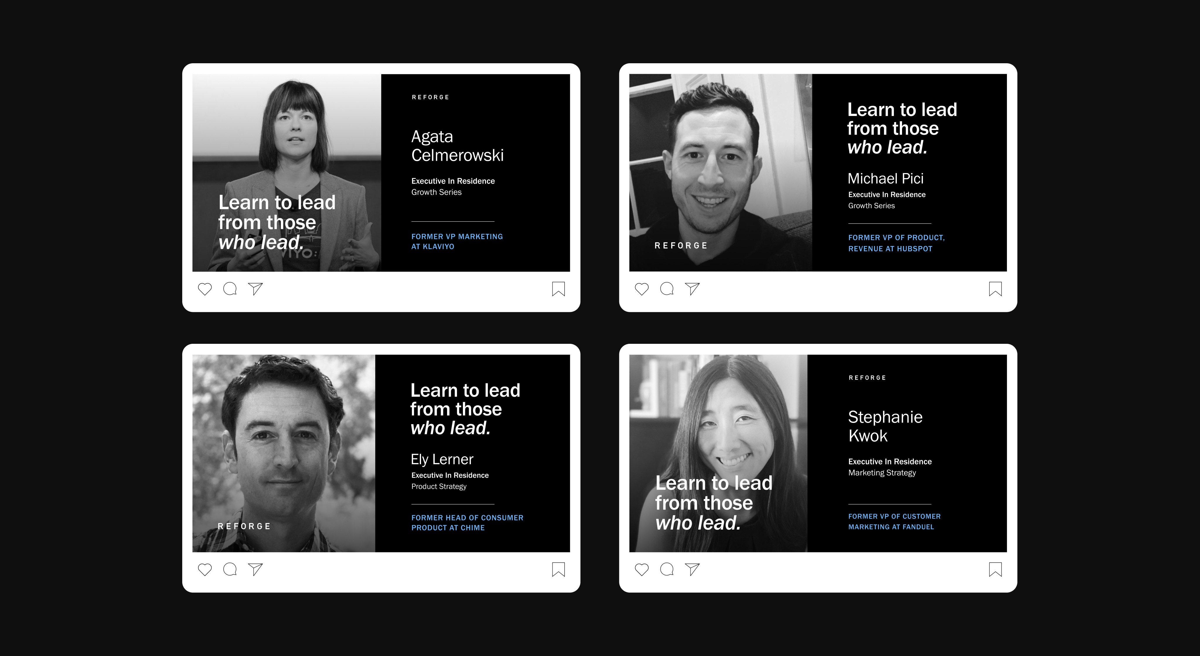
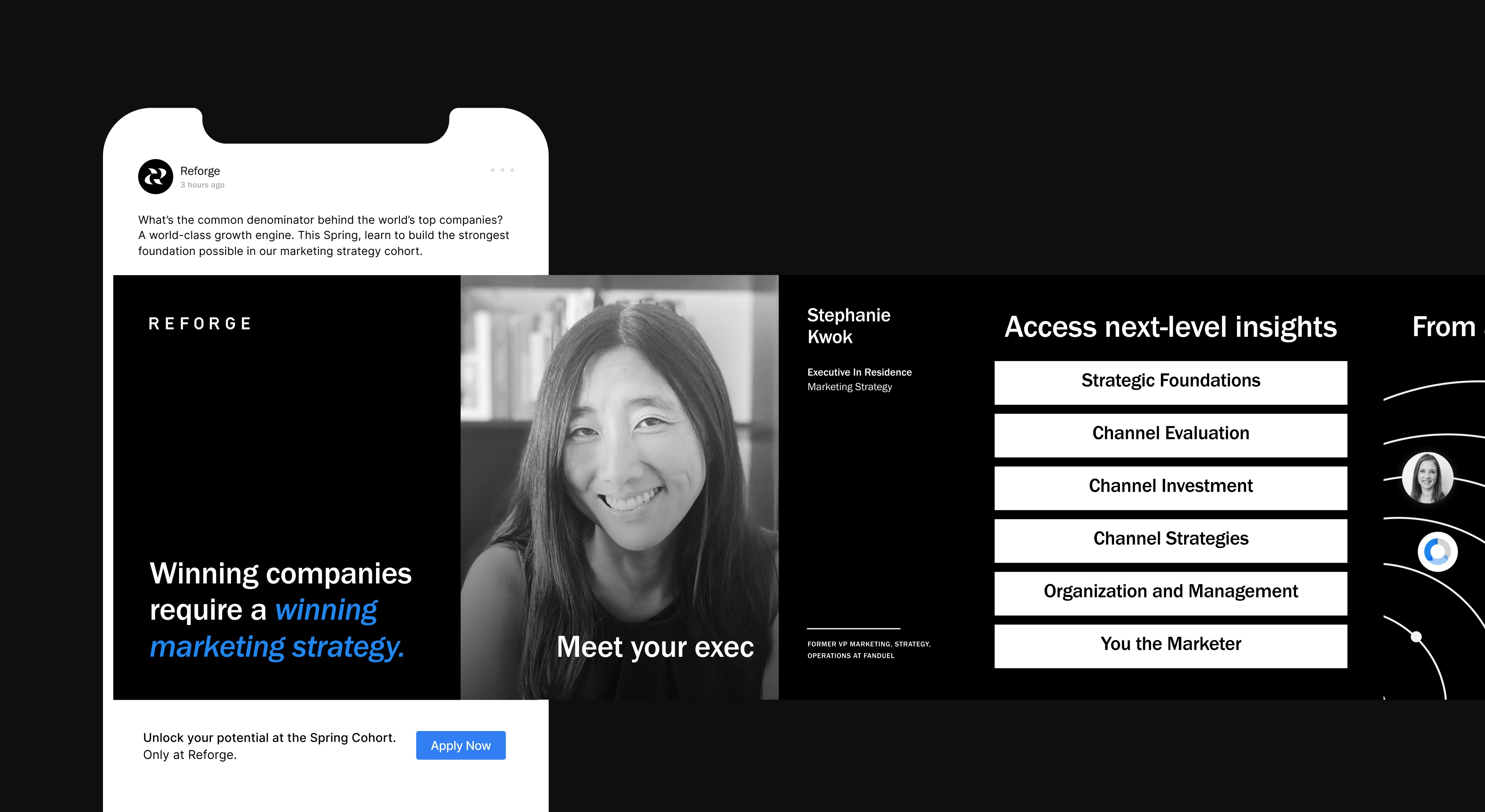
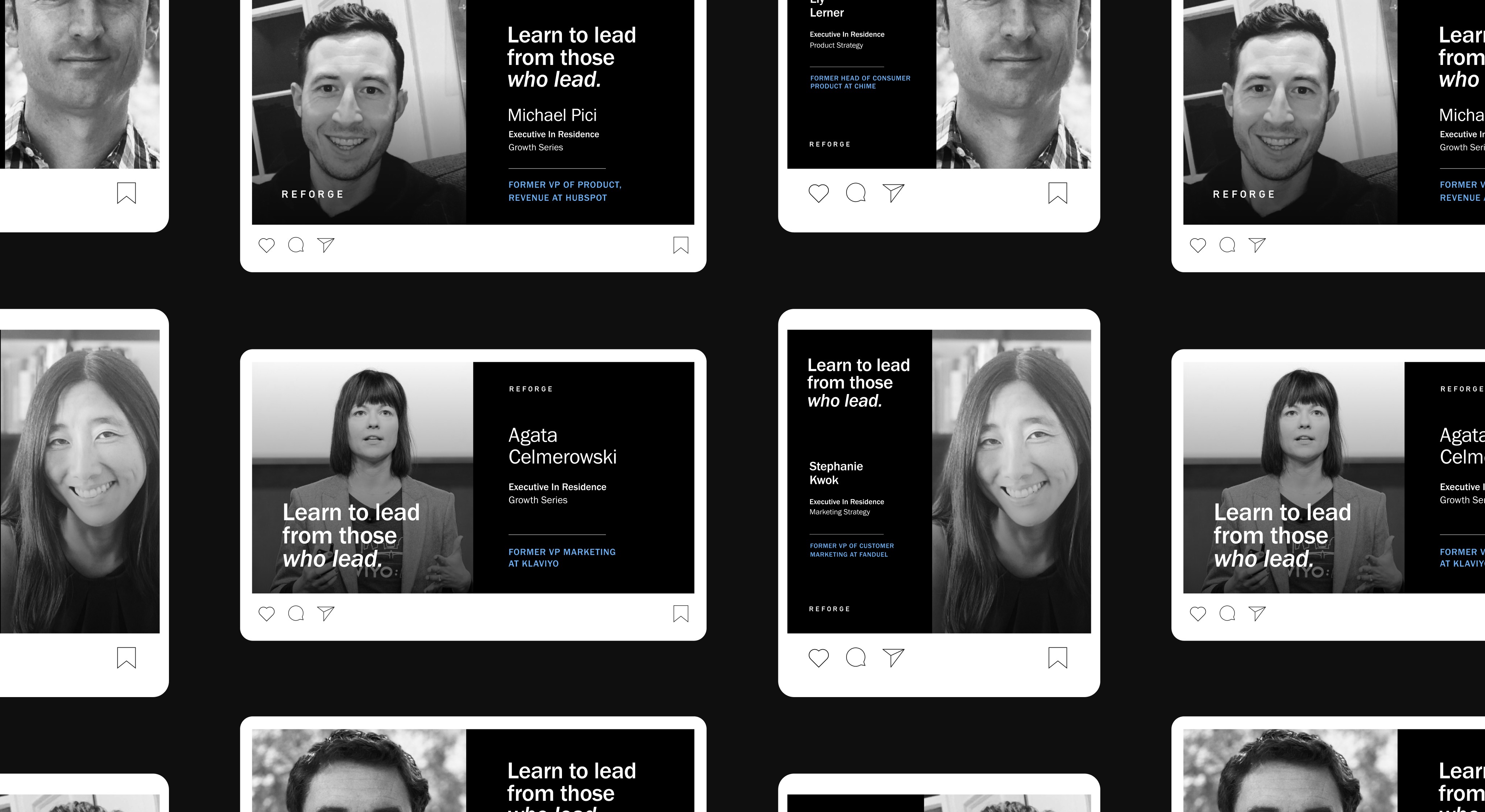
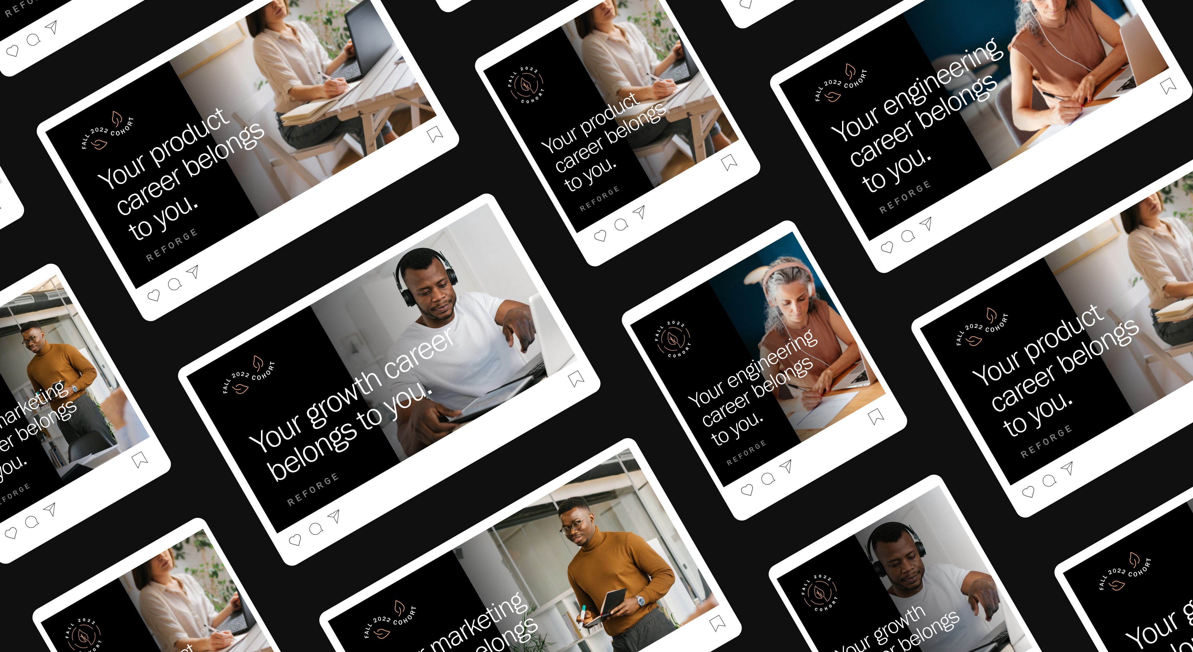
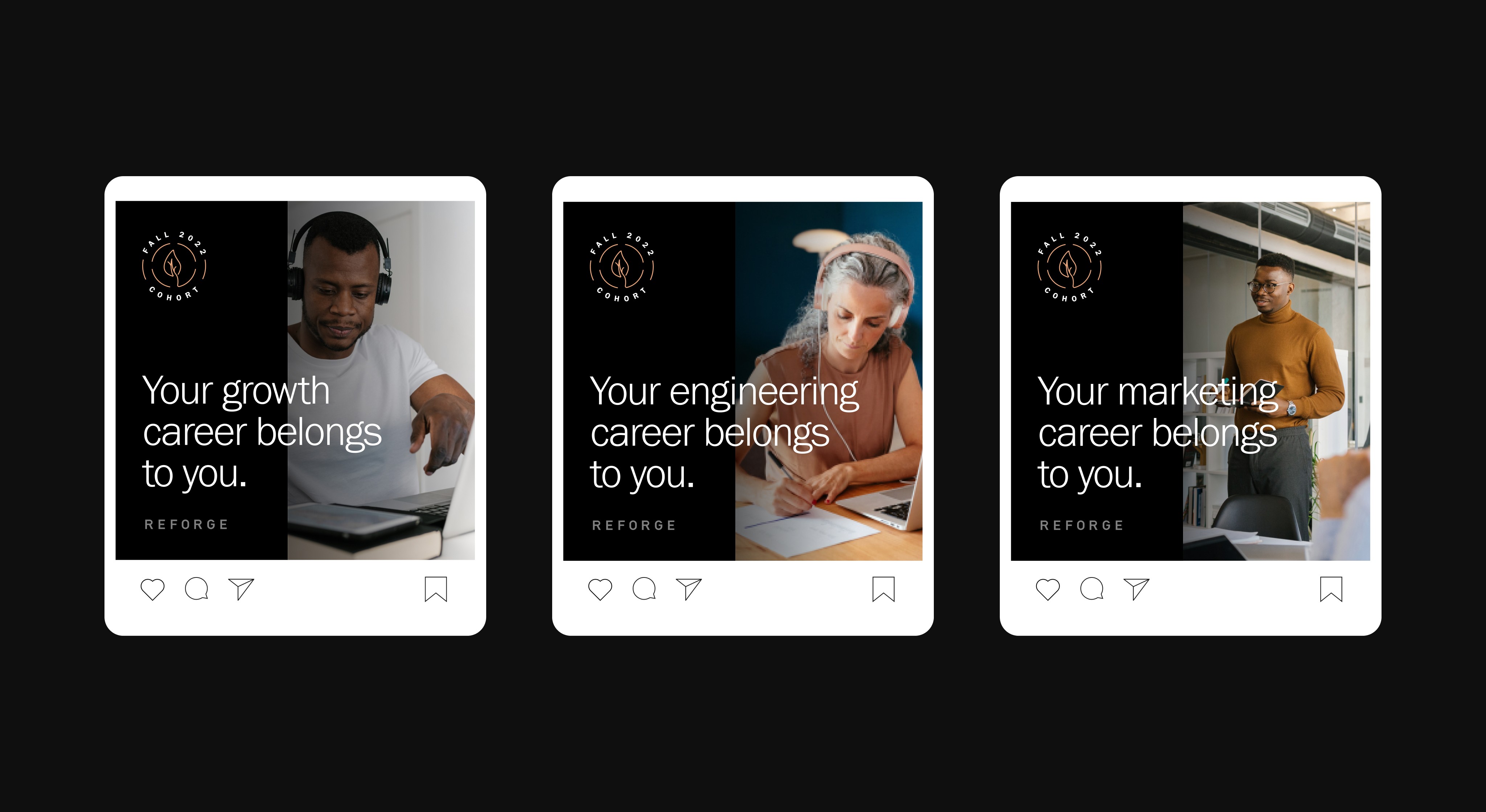
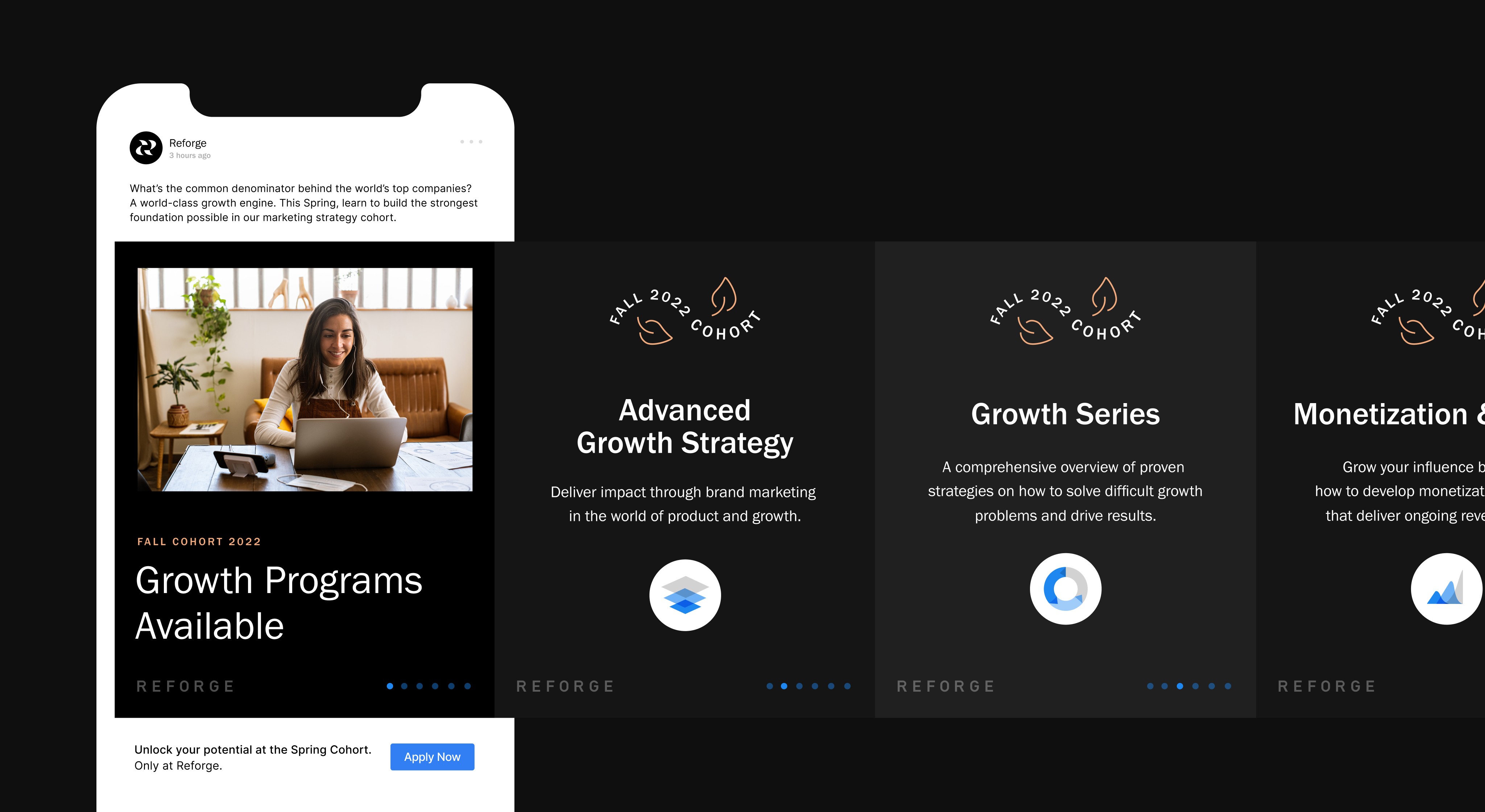
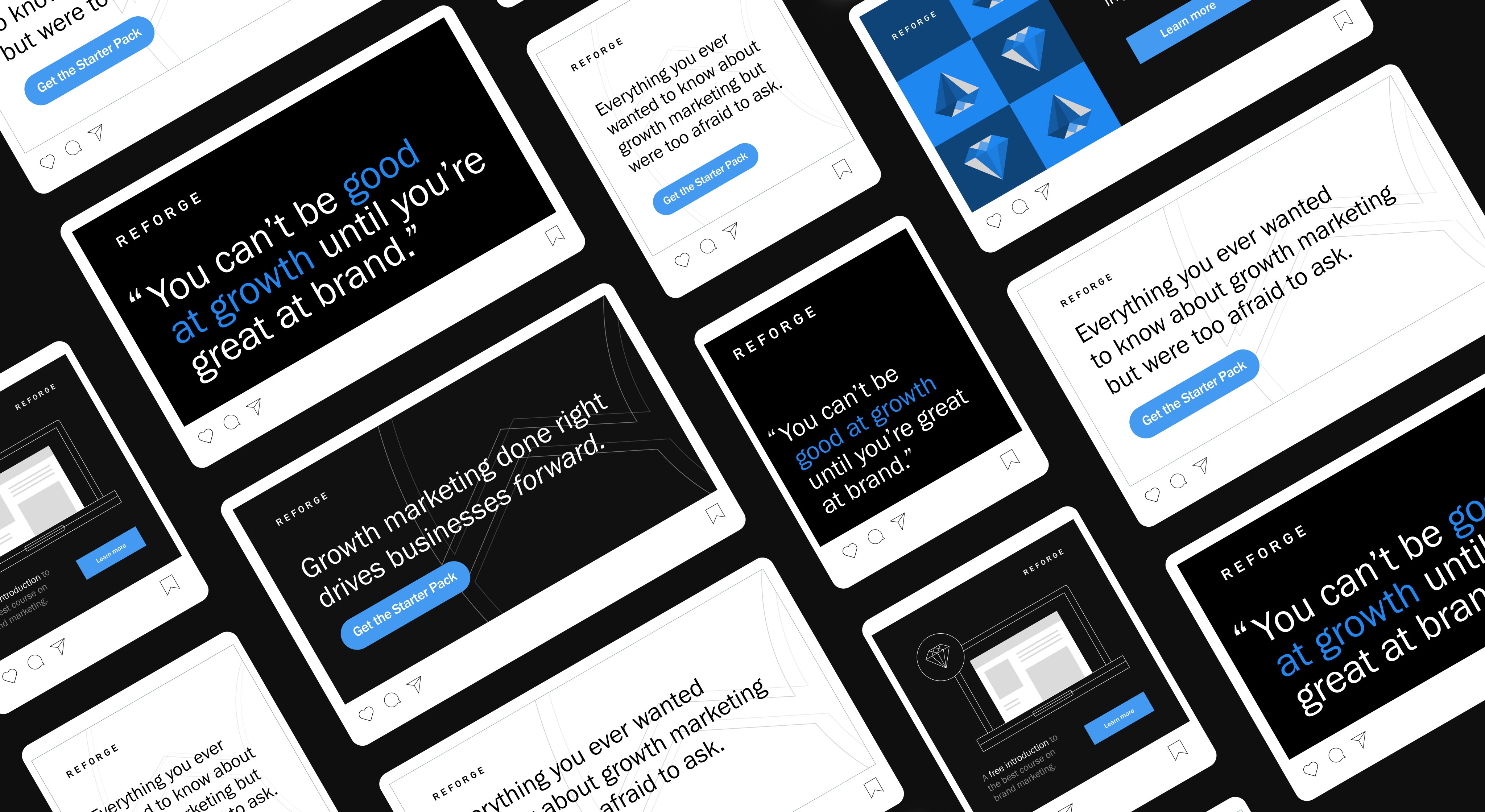
Phase I yielded some key takeaways both in terms of brand design, what grabs our user's attention and leads to the highest conversion, and which content pillars were most successful. All of which impacted Reforge's fall cohort structure and offerings. This cohort marketing campaign was our launch of Phase II, which was running in tandem with a rebrand being led by Koto. This phase was meant to introduce elements of our rebrand to our audience to see if they would hold traction and improve key metrics like application conversion. Additionally, Phase II boasted the new media of Google Ads.
Visually there were a couple of things I leaned into to help with this goal. I led with a darker more luxury palette inspired by user's reporting of using Dark Mode to engage our courses. I curated a stock photography library to introduce color into photographic moments. I began expanding the color palette to introduce more pastel tones (but making sure they fit the seasonal content they were tied to.) Finally, I began leveraging our course "badges" as illustrative texture in the form of pattern and scale.
/Phase III: Rebrand Launch
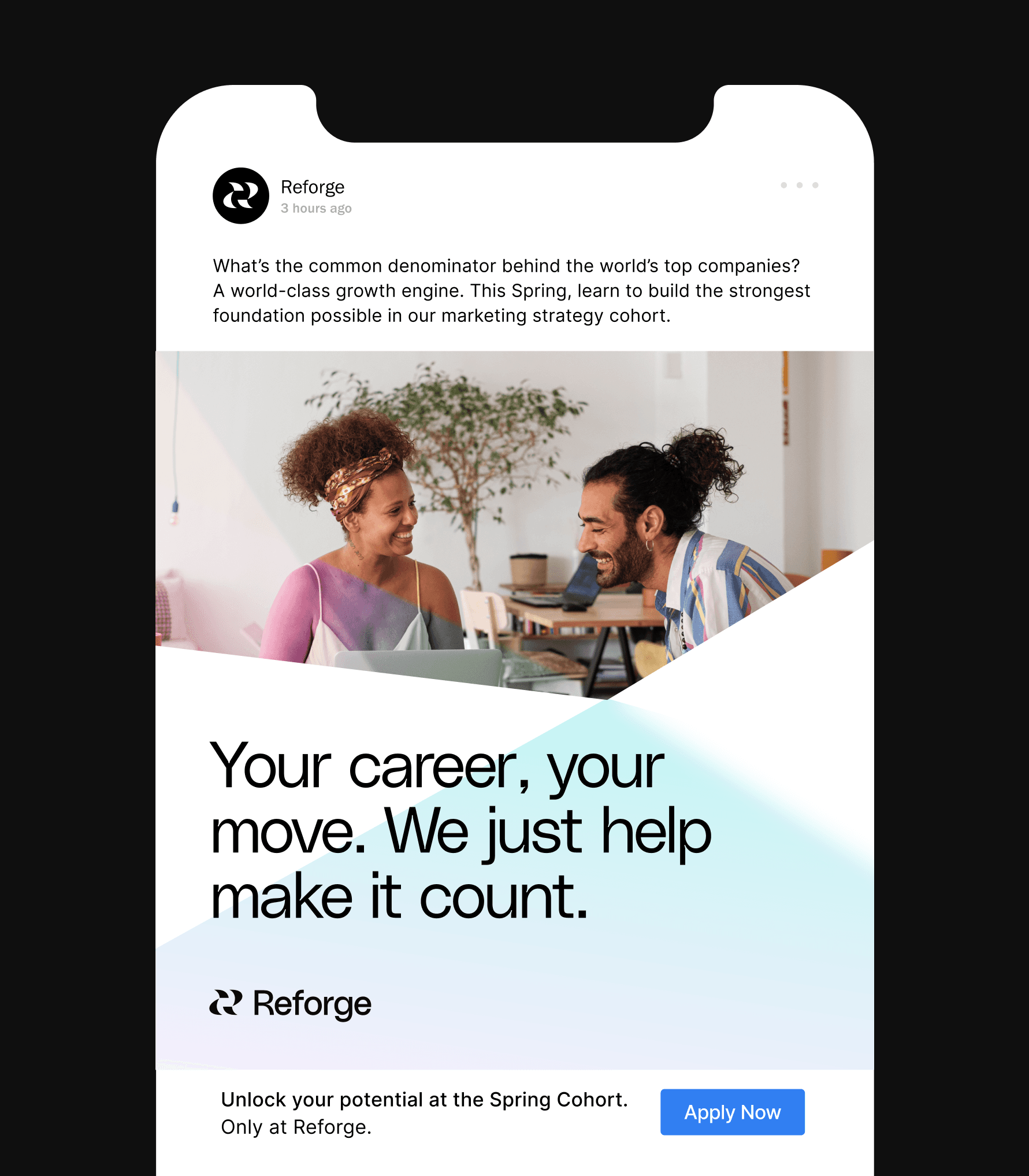
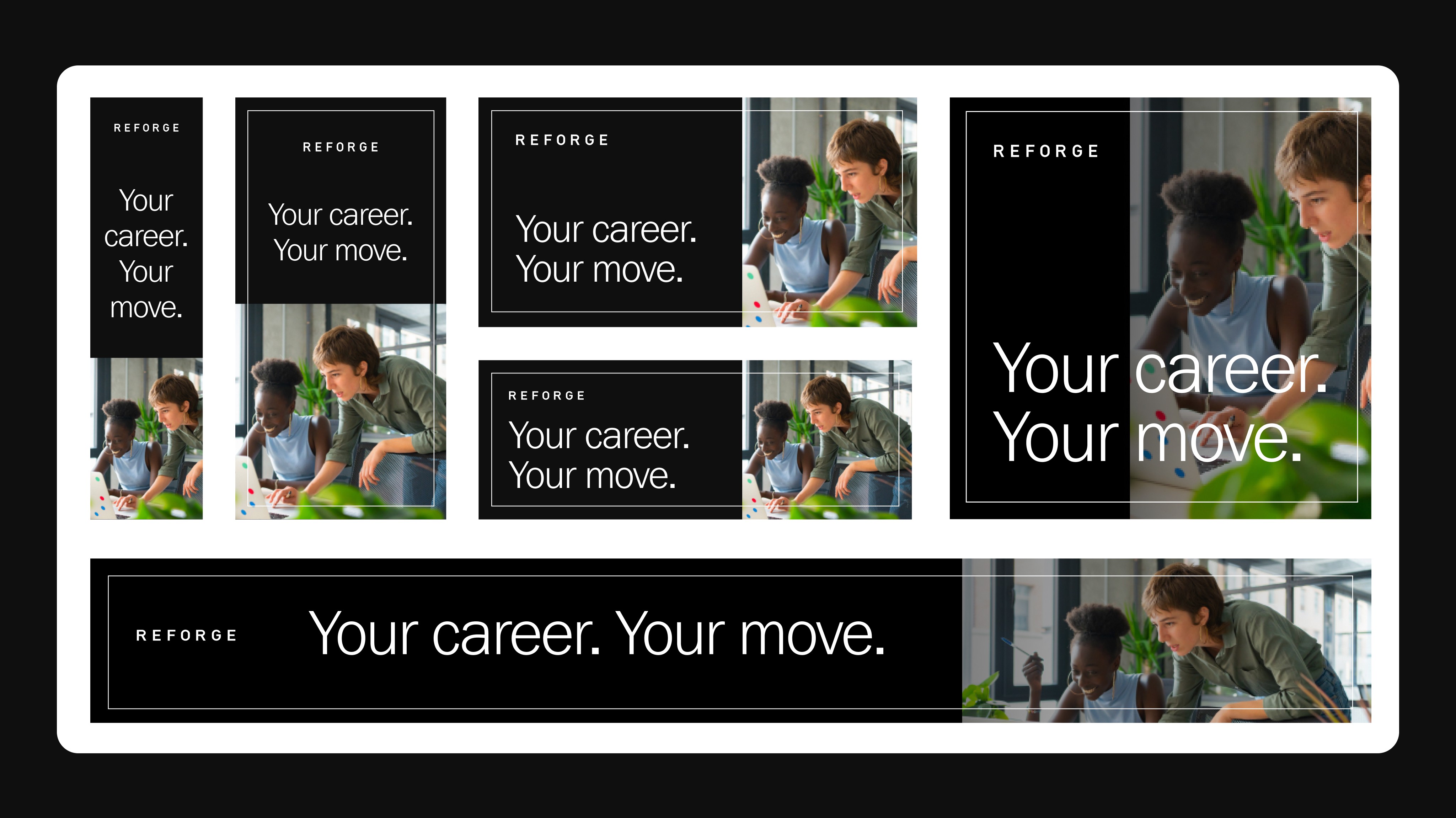
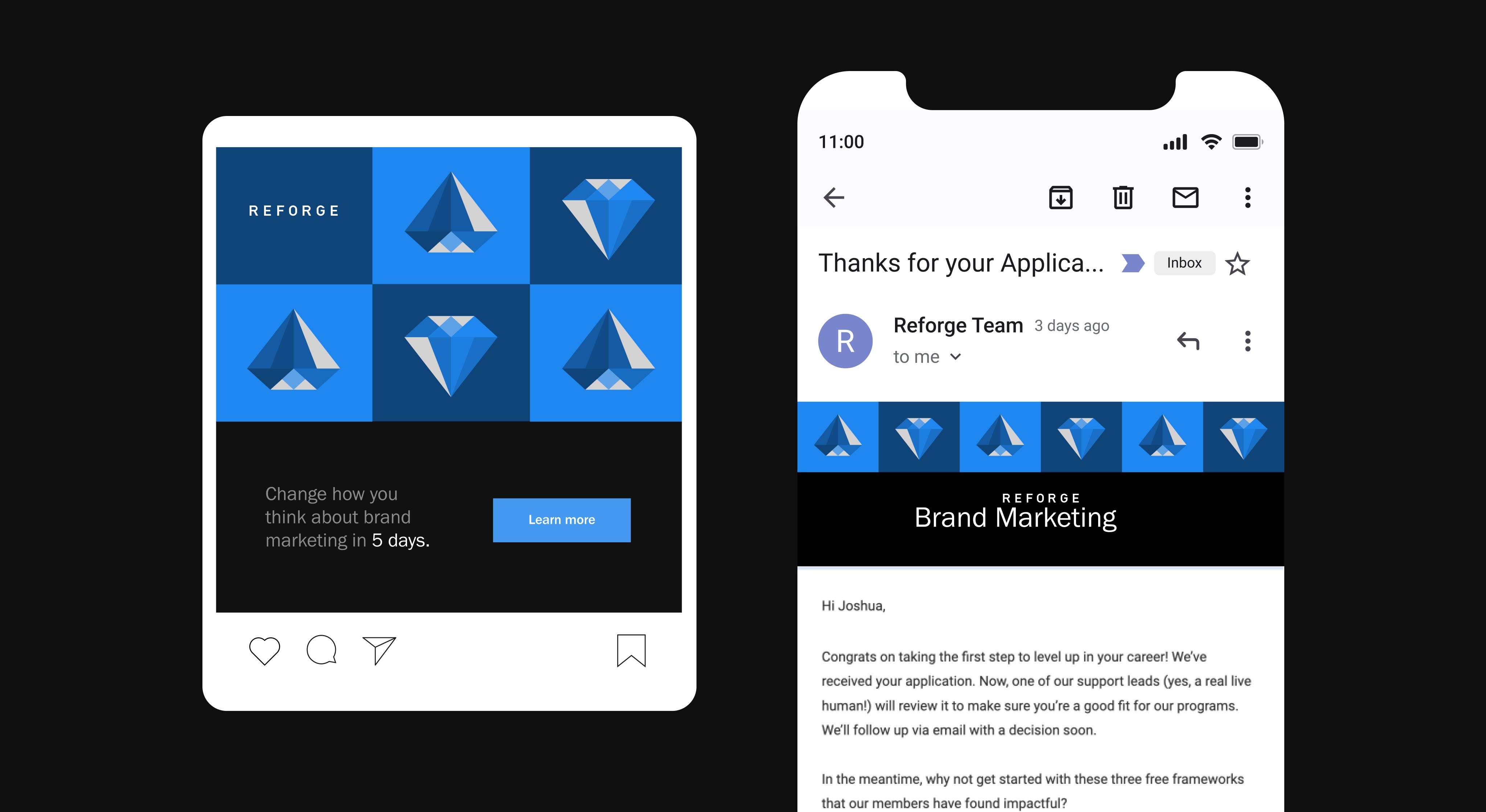
Phase III, by far was both the most simple phase as well as the most strenuous. Simple, because by this point in our paid media journey, Reforge knew what trends, design styles, and content worked best with our consumers. However, after completing our rebrand it was clear that the time would need to be spent arming the teams with a scaleable system to adopt or rebranded styles to the paid media applications.
This culminated in my building an end-to-end Figma-based asset library that our growth and marketing teams could venture into for quick turn collateral. Additionally, this phase was all about finding out new brand's visuals breakpoints. We began venturing into drip campaigns, and YouTube ads as well as affiliate marketing to usher in our relaunch campaign.
