joshy coleman

SENIOR BRAND & WEB DESIGNER

[MENU]

joshy coleman

[MENU]

Rising Tide Travel

Rising Tide Travel

Rising Tide Travel

Brand Identity and Website

Brand Identity
and Website

Brand Identity
and Website

2021
2021
2021
BRAND DESIGN
ART DIRECTION
ILLUSTRATION
WEB DESIGN
BRAND DESIGN
ART DIRECTION
ILLUSTRATION
WEB DESIGN
BRAND DESIGN
ART DIRECTION
ILLUSTRATION
WEB DESIGN
ROLE
ROLE
ROLE
BRAND DESIGNER
BRAND DESIGNER
BRAND DESIGNER

/Over-

View

/Over-

View

Covid 19 shook many industries to their core. It forced everyone to truly take a step back and access what is important to them. For John and Liz Cincotta, turning their love for travel into a much anticipated travel agency/service was top of mind.

I was approached by KedzieT Consulting and asked to build for them a visual identity that could help bring this husband and wife team into the modern era and show the world how luxury travel experiences need not always come with luxury price tags.

/Solu-

tion

/Solu-

tion

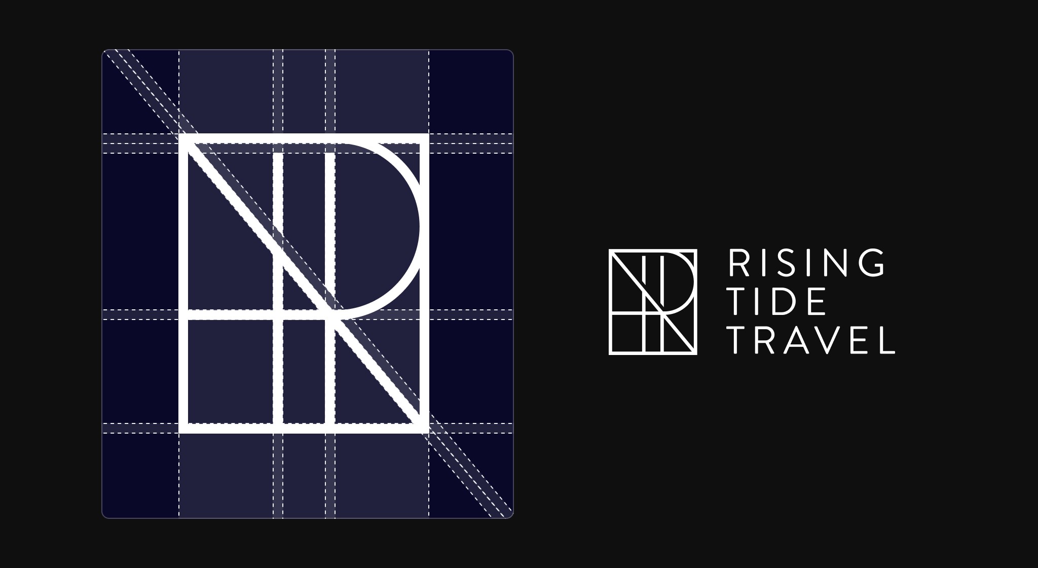
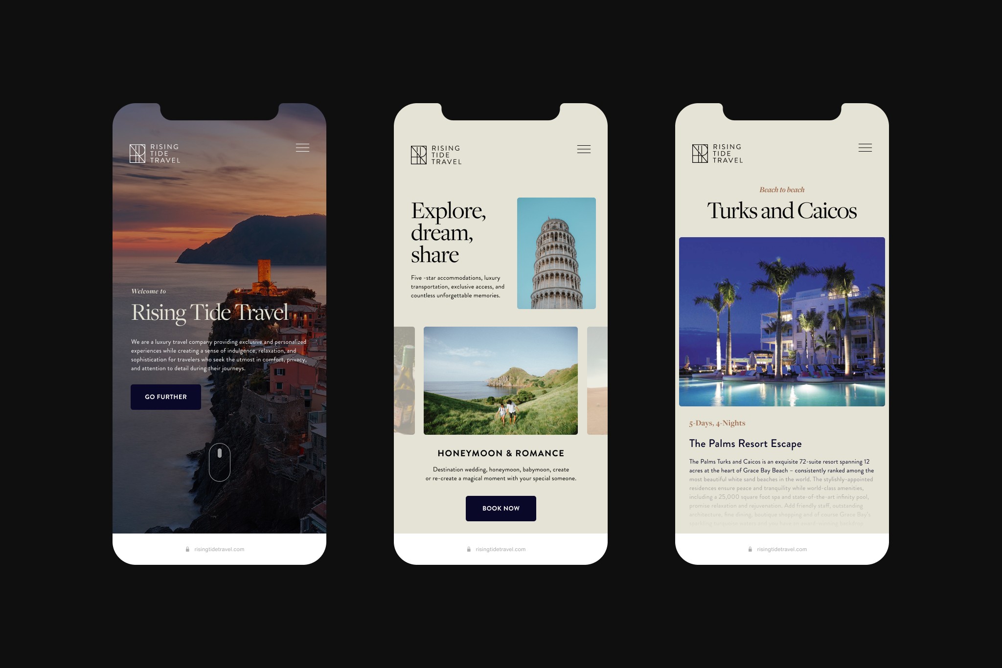
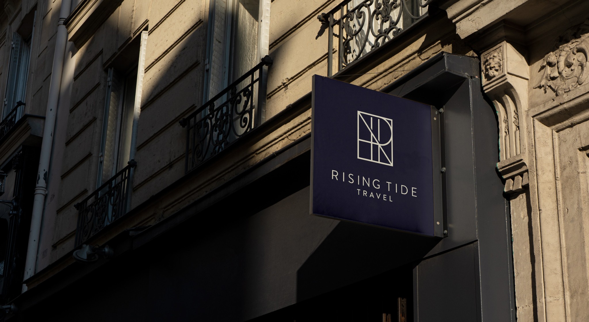
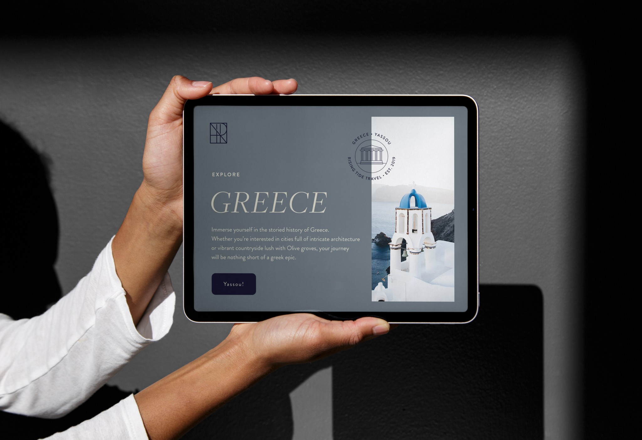
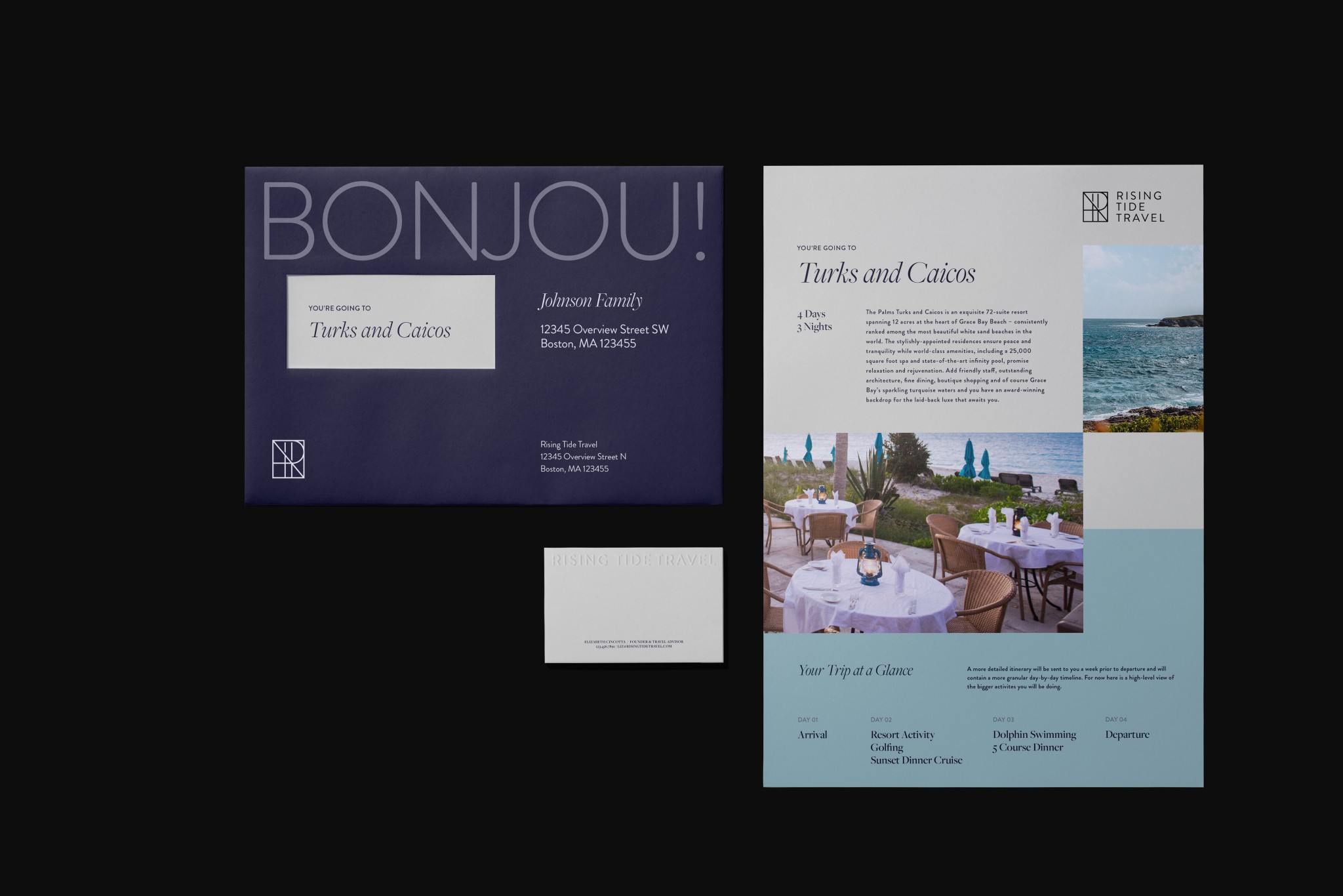
The resulting visual identity and website are rooted in traditional styles with flares of modernism that reflect the studio's owners, John and Liz. The identity was designed around showcasing the grandiose moments of luxury travel, and translating the luxury experience into every touchpoint. Most importantly, the system is incredibly scaleable an offers many unique components that help the brand better tailor an experience to the journey their clients are embarking upon. By building in tools like Squarespace and Canva, I empowered the Rising Tide Team to perform brand maintenance and created a pathway for them to build their own collateral.

/Inspiration

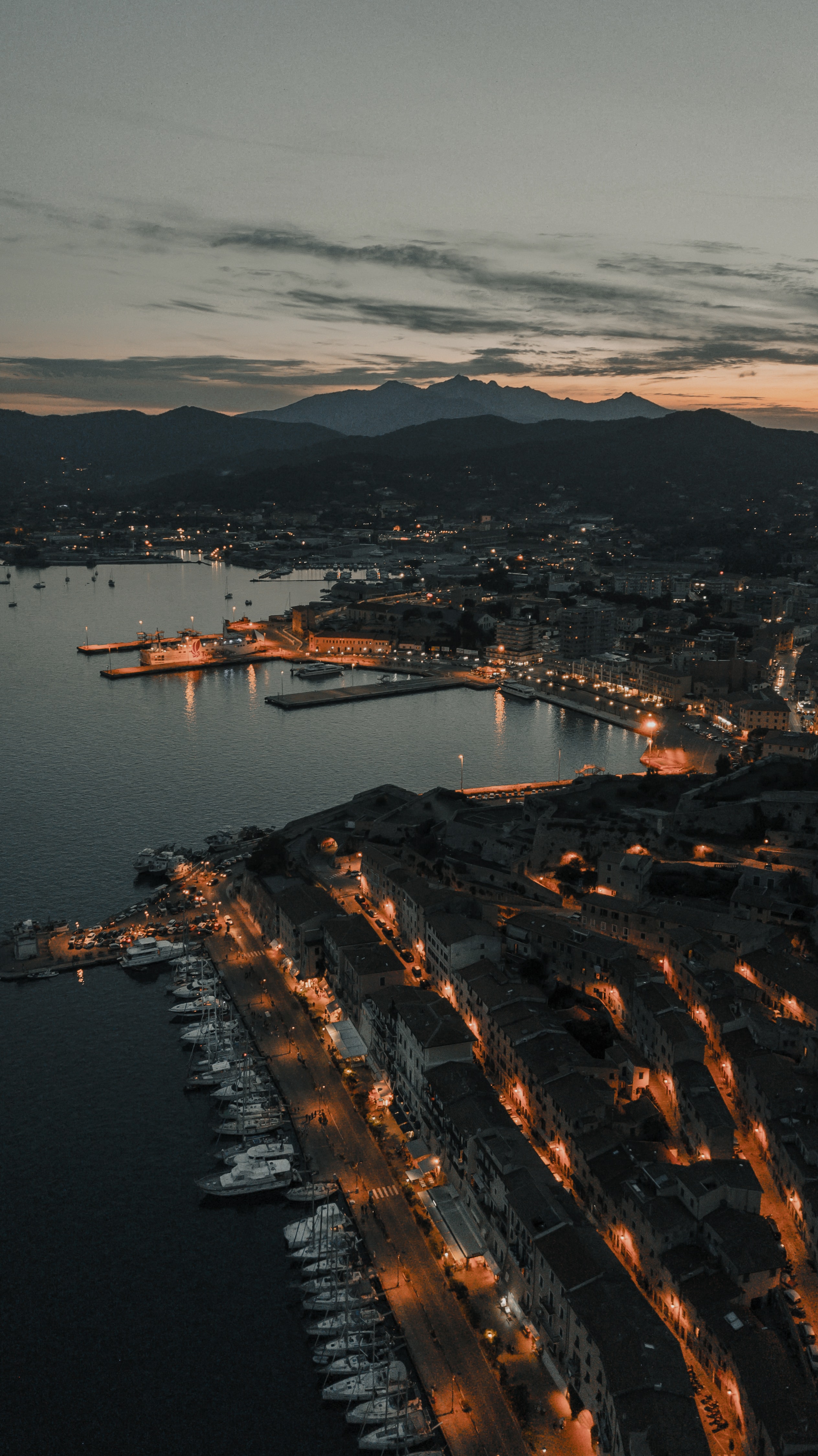
In ideating for Rising Tide Travel, I was continuously inspired by the locations and network the studio had it's disposal. It was very clear the system and identity would circumnavigate around a curated photography library. RTT's origin story began in Rome, so naturally, I leaned into more classical (almost ancient) styles and elements to help create a luxurious feeling to the identity.

/Typography

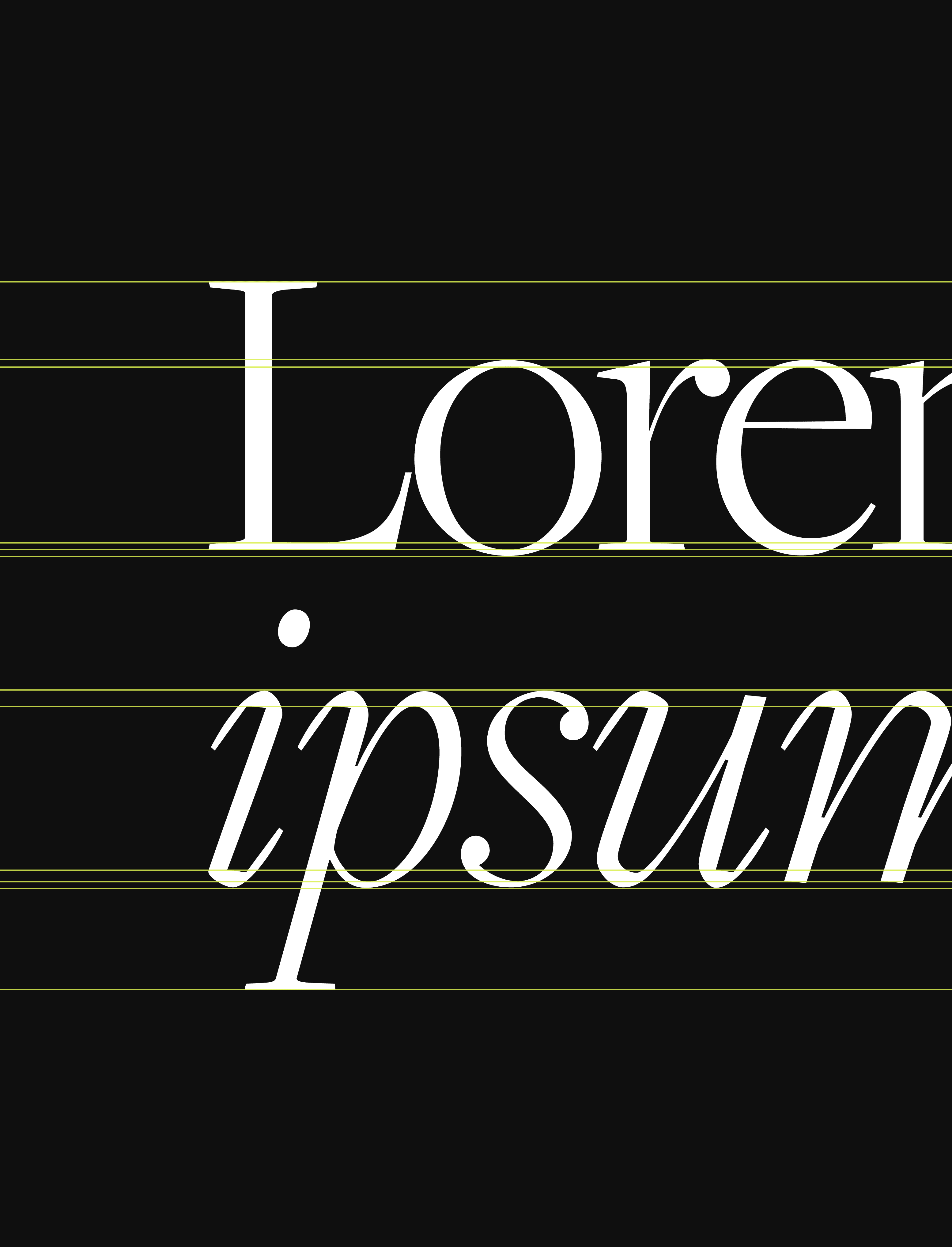
Sourcing typography was one of the very first things I did when building the Rising Tide brand. I knew one of the best ways to showcase the luxurious experiences the studio creates was by leading with a powerful, yet functional serif. I opted for 'Freight Display' which boasts roman serif ligatures. Specifically, I leaned into the thin and regular weights to help capture the airy and openness typically seen in luxury brands. For functionality I paired the beautiful serif with 'Brandon Grotesque' which at the time, was catching heat in the type world for its highly geometric yet human styles. This helped bridge the traditional into the modern.

Sourcing typography was one of the very first things I did when building the Rising Tide brand. I knew one of the best ways to showcase the luxurious experiences the studio creates was by leading with a powerful, yet functional serif. I opted for 'Freight Display' which boasts roman serif ligatures. Specifically, I leaned into the thin and regular weights to help capture the airy and openness typically seen in luxury brands. For functionality I paired the beautiful serif with 'Brandon Grotesque' which at the time, was catching heat in the type world for its highly geometric yet human styles. This helped bridge the traditional into the modern.

/Color Palette

The colors of Rising Tide are built on two pillar locations to the studio's services, Rome and Santorini. Both destinations boast luxury but exercise them in different ways. The palette is a seamless marriage between the open, airy and coastal tones of Santorini, with the more ancient, traditional, and neutral tones of Rome. For accessibility and some fun brand narrative, opted to replace traditional black with a more deep rich navy I called "Dark Waters," and a lighter tan called "David Tan" after the statue of David.

/Accoutrement

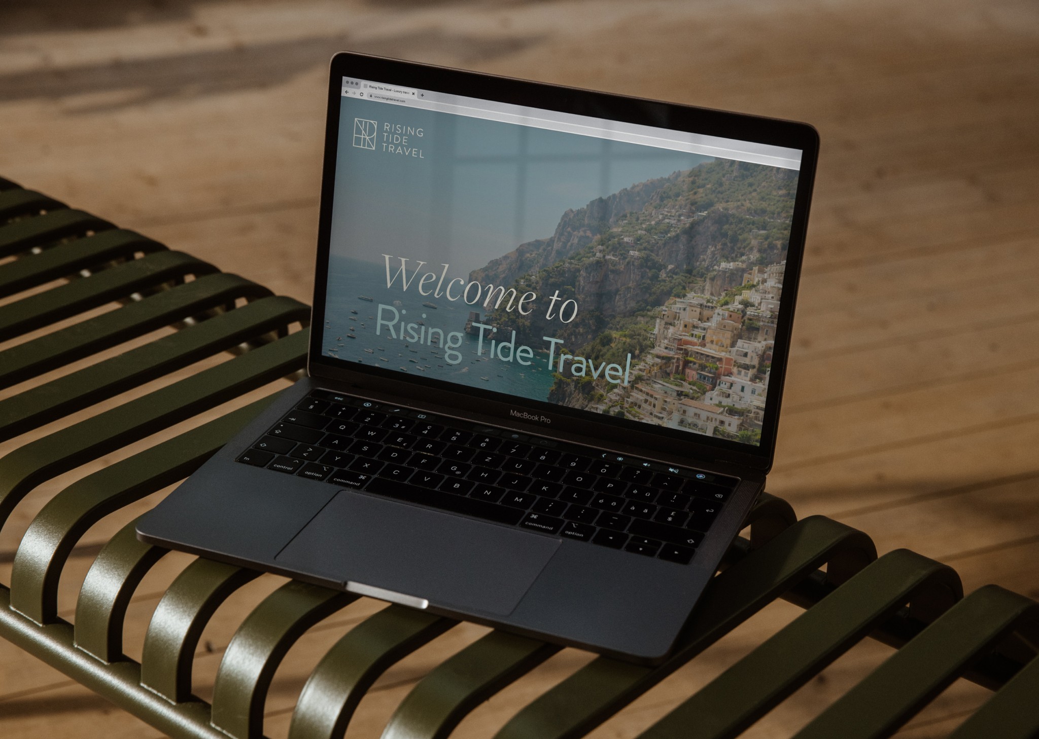
The visual identity built for Rising Tide Travel captures the luxury travel they offer as a service, paired with simplicity and scalability for their small team. The system shines provides curated elements that can change pending a client’s destination or content in which the brand is representing. This allows Rising Tide Travel, to provide it’s users with a unique and tailored experience without the luxury experience price tags. Building their website through Squarespace, I was able to provide the RTT team with easy, and no-code methods allowing for each maintenance and additions should they ever need it.

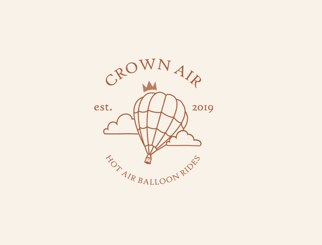
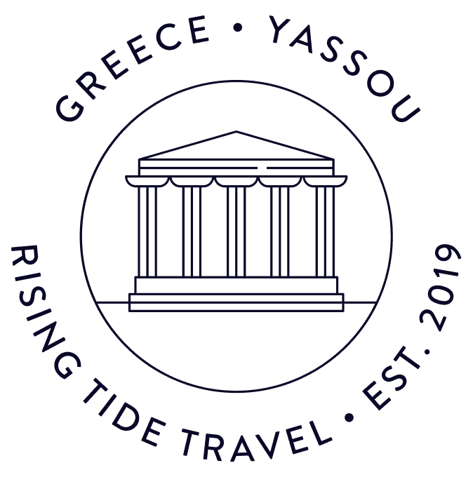
One of the most fun elements of the Rising Tide Travel brand is it's use of small badge illustrations. These were inspired by passport stamps and focus around a key landmark of the client's destination/or piece of content it was tied to. After the team landed on a brand direction, I built an initial batch of around 10 different locations each with two variations, the first following a more traditional passport stamp, and the second leaning into the postal stamp aesthetic.

  • JOSHY COLEMAN

  • Brand & Web Designer

Let's work

together

  • JOSHY COLEMAN

  • Brand & Web Designer

Let's work

together

  • JOSHY COLEMAN

  • Brand & Web Designer

Let's work

together